App Store Optimization Screenshots: Proven Strategies For
Master app store optimization screenshots with proven strategies for iOS and Google Play. Learn specs, A/B testing, and conversion tactics.

A strong screenshot set can lift install conversion by roughly 20% to 35%, while the average visitor spends only about seven seconds on an app product page, according to 2026 app-store screenshot benchmarks. That leaves very little time for a gallery to explain what the app does, who it helps, and why it deserves an install.
The bigger shift is algorithmic. Apple now treats screenshots as testable product-page assets, and industry coverage reports that Apple extracts text from screenshot captions through OCR for keyword relevance. App store optimization screenshots therefore serve two jobs at once. They must persuade people visually and communicate searchable language clearly enough for the platform to interpret.
Table of Contents
- Why Screenshots Drive More Installs Than Any Other Asset
- Technical Specifications for iOS and Google Play
- Designing a High-Converting Screenshot Sequence
- Writing Captions That Rank and Convert
- Streamlining Multi-Device Screenshot Production
- Running Screenshot A/B Tests That Actually Inform Decisions
- Avoiding Common Rejection Pitfalls and Submission Errors
<a id="why-screenshots-drive-more-installs-than-any-other-asset"></a>
Why Screenshots Drive More Installs Than Any Other Asset
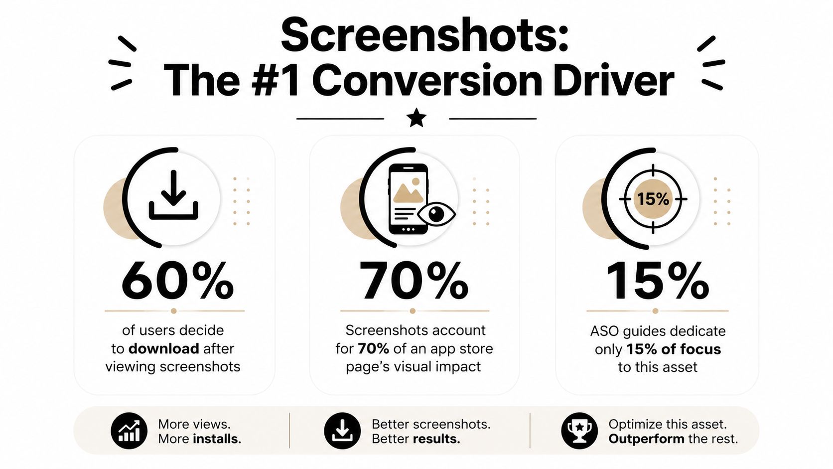
A product page visitor rarely studies every asset with equal attention. Benchmark coverage reports that roughly half of users only view the first one or two screenshots, while another summary found that only 17% scroll beyond the first screenshot and only 11% reach screenshot five. Those figures come from independent 2026 screenshot benchmark coverage, and they point to a practical conclusion: the opening frames carry most of the gallery's persuasive load.
The first screenshots must answer the visitor's immediate questions without requiring a description deep dive. What problem does the app solve? What outcome can the user expect? Does the interface look credible? A polished icon earns attention, but screenshots provide the evidence that turns curiosity into confidence.
<a id="screenshots-became-measurable-assets"></a>
Screenshots became measurable assets
Apple's Product Page Optimization framework lets developers compare different product-page versions, including screenshot sets, icons, and app preview videos. That matters because screenshots are no longer merely static merchandising. Teams can form a hypothesis, publish an alternate treatment, and evaluate which combination generates stronger engagement.
The operational benefit is significant even when a test doesn't produce a winner. A failed test can show that the promise was unclear, the order was wrong, or a feature lacked relevance. Without experimentation, teams often debate subjective details such as gradients, device frames, and background colors while missing the message that visitors see first.
Practical rule: Treat the first screenshot like a landing-page hero section, not like a product manual.
A 2026 benchmark dataset covering 200 indie apps reported a median App Store conversion rate of 31.2% and a top-quartile rate of 42.8%. The same benchmark reported that text-first openings outperformed device-only openings by 27%, while a headline-benefit first frame converted at 39.8%, compared with 31.3% for full-bleed device mockups without text. These figures are from ShotLingo's 2026 conversion benchmark, and they support a clear design position: show the interface, but don't make the interface carry the entire sales message.
<a id="technical-specifications-for-ios-and-google-play"></a>
Technical Specifications for iOS and Google Play
Creative quality cannot compensate for a failed upload. Apple and Google Play apply different file rules, so one concept still requires platform-specific exports, crops, and review checks.
Apple's workflow is organized around device sizes. The App Store accepts JPEG or PNG files in RGB, without transparency, and allows up to 10 screenshots per localization, per AppTweak's screenshot requirements guide. Common portrait targets include 1242 × 2688 pixels for the iPhone 6.5-inch display, 1242 × 2208 pixels for the iPhone 5.5-inch display, and 2048 × 2732 pixels for the 12.9-inch iPad Pro. Build captions into the artwork at a size that remains readable after the store scales the image. Those captions can support conversion and provide indexed text through Apple's OCR.
Google Play permits a broader range of dimensions and supports more device categories. Accepted files include JPEG and 24-bit PNG without alpha transparency. Screenshots need a minimum dimension of 320 pixels, a maximum dimension of 3840 pixels, and an aspect ratio in which the longest dimension is no more than twice the shortest. Google Play allows up to eight screenshots per device type, including phones, tablets, Wear OS, and Android TV.
<a id="screenshot-specifications-by-platform"></a>
Screenshot Specifications by Platform
| Platform | Required Sizes | Format | Max File Size | Device Frames |
|---|---|---|---|---|
| iOS App Store | Common targets include 1242 × 2688, 1242 × 2208, and 2048 × 2732 pixels | JPEG or PNG, RGB, no transparency | Follow current App Store upload limits | Optional, but must not obscure or misrepresent the interface |
| Google Play | Minimum dimension 320 pixels, maximum dimension 3840 pixels, with the longest side no more than twice the shortest | JPEG or 24-bit PNG, no alpha transparency | Follow current Play Console upload limits | Avoid frames that imply unsupported hardware or functionality |
<a id="production-checks-that-prevent-rework"></a>
Production checks that prevent rework
Keep important copy inside safe areas. System regions, notches, and dynamic cutouts can cover text or shift its visual balance. Device frames add context, yet they can reduce UI scale and create mismatched presentations across iPhone, iPad, and Android exports.
Before export, inspect every file for readable captions, current interface states, accurate localization, and clean test data. Confirm that each screenshot matches the submitted build. Google Play warns against misleading representations, fake buttons, and stylized visuals that do not match the actual product experience. Also review captions for OCR clarity: decorative type may look polished while weakening both comprehension and discoverability.
<a id="designing-a-high-converting-screenshot-sequence"></a>
Designing a High-Converting Screenshot Sequence
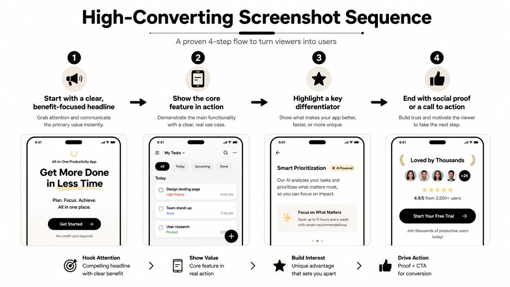
The strongest gallery is a short sales narrative. It doesn't present features in the order they were built, and it doesn't begin with a splash screen because the development team likes the animation. It starts with the user's desired outcome, then uses the interface as proof.
A practical sequence looks like this:
- Lead with the benefit. Replace “Advanced task management” with a result such as “Know what to do next.”
- Show the core feature working. Make the relevant UI large enough to inspect.
- Prove differentiation. Highlight the workflow, integration, or capability that separates the app from familiar alternatives.
- Resolve hesitation. Use a final frame for trust, simplicity, privacy, or a clear next step.
<a id="why-text-first-openings-win"></a>
Why text-first openings win
A device-only opening assumes visitors will understand the interface immediately. Most won't. A dashboard, editor, map, or workout screen can look attractive while saying nothing about why it matters.
The benchmark from ShotLingo found that a headline-benefit first frame converted at 39.8%, compared with 31.3% for a full-bleed device mockup without text. The lesson isn't to remove the product UI. It's to give the UI a job. The caption states the outcome, and the screen demonstrates that the outcome is real.
A screenshot should make the right visitor recognize their problem before it asks them to admire your interface.
For a utility app, lead with speed, simplicity, or the problem removed. A document scanner might open with “Turn paper into searchable files,” followed by the scan and export flow. A productivity app can show the promised workflow in action, then reveal collaboration or automation. A lifestyle app may need emotional context, but the caption still needs to connect the mood to a concrete benefit.
<a id="build-the-first-three-frames-as-one-argument"></a>
Build the first three frames as one argument
The first frame earns attention. The second makes the promise tangible. The third answers the most important doubt.
For a fitness product, that might mean a personalized plan, a workout in progress, and progress tracking. For a finance app, it could be spending visibility, a forecast, and control over recurring payments. For a travel app, use the destination plan first, then the daily itinerary, then offline access or booking organization.
Don't force every feature into the opening. Secondary features belong later, where they can support users who are already interested. One frame should communicate one idea, with enough whitespace for the headline and enough UI detail to make the claim believable.
<a id="writing-captions-that-rank-and-convert"></a>
Writing Captions That Rank and Convert
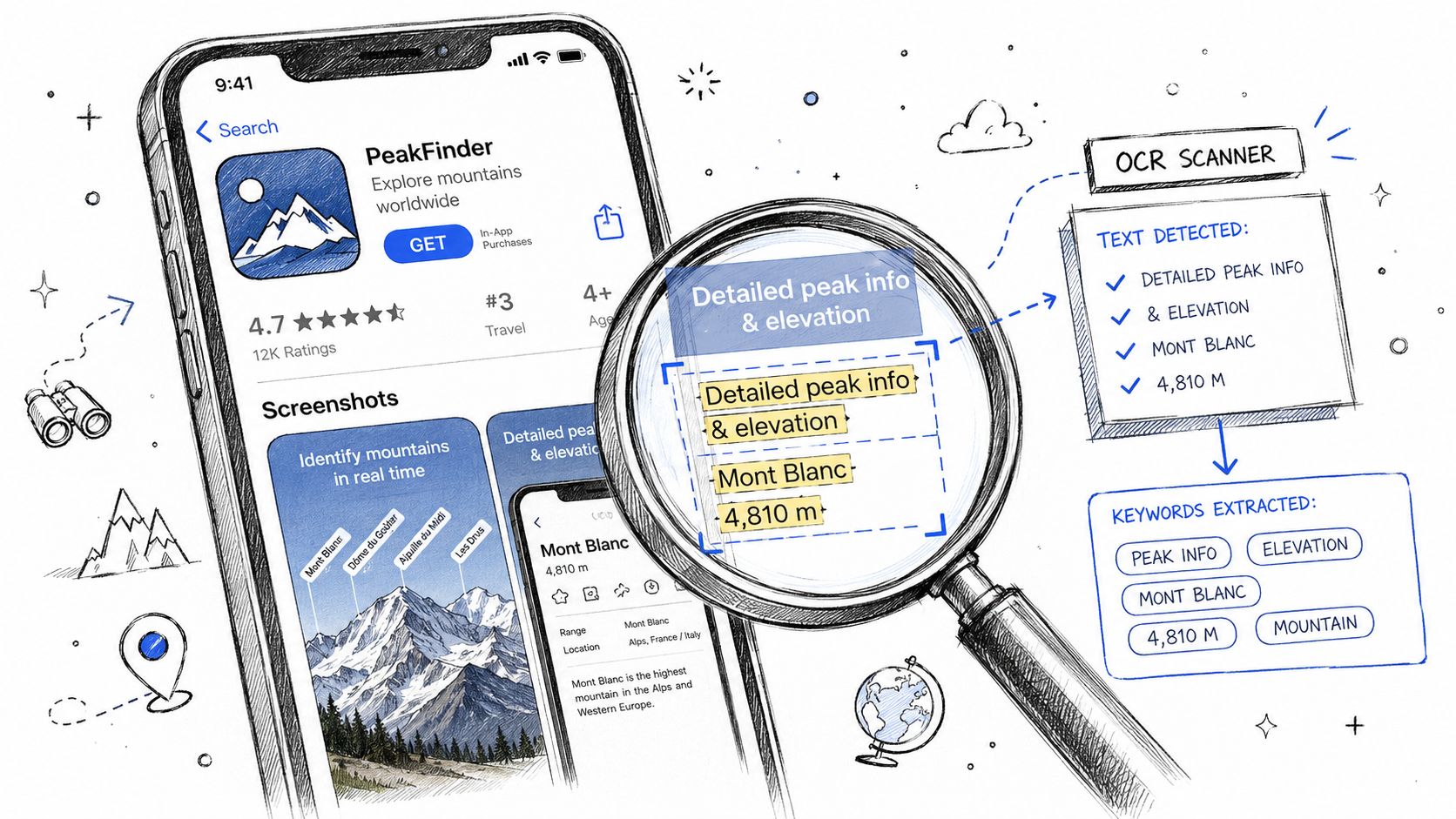
Captions have traditionally been treated as decoration layered over a UI capture. That assumption is now risky. Industry coverage reported in AppFigures' discussion of Apple's 2025 algorithm update that Apple began extracting text from screenshot captions and treating it as keyword-relevant metadata. The practical implication is direct: caption writing now influences both human comprehension and machine interpretation.
That doesn't mean stuffing keywords into oversized overlays. Awkward phrases reduce trust, and cluttered copy makes the screenshot harder to scan. Write captions around search intent, then make the sentence sound like a natural benefit statement.
<a id="put-keywords-inside-useful-messages"></a>
Put keywords inside useful messages
Start by identifying the phrase a qualified visitor would use, then connect it to an outcome. “Budget planner” is a category label. “Build a budget planner before payday” gives the phrase a job. “Language learning app” describes the product. “Practice language learning with daily lessons” connects the category to an action.
Use the primary intent in the opening frame when it fits naturally. Later captions can cover adjacent use cases, features, and objections without repeating the same phrase mechanically. Keep the type large, high contrast, and free from decorative effects that can confuse OCR.
A caption also needs to survive reduced previews. If the visitor can't read it while scrolling, the keyword may be technically present but practically useless. Test the smallest storefront representation, not only the full-resolution artboard.
<a id="localization-changes-the-creative-brief"></a>
Localization changes the creative brief
Translation alone often produces stiff or overlong overlays. Each market needs language-specific line breaks, idiomatic benefit phrasing, and UI examples that feel native to the user. The 2026 guidance summarized by AppFigures reports that localized screenshot captions outperformed English-only overlays by 18% to 35% in non-English markets, making localization a creative performance decision rather than a final production task.
That also affects OCR. A translated caption that wraps into an awkward third line, overlaps the device render, or uses low-contrast text can hurt both readability and machine extraction. Build localization into the template from the start, and review every priority language at actual store size.
<a id="streamlining-multi-device-screenshot-production"></a>
Streamlining Multi-Device Screenshot Production
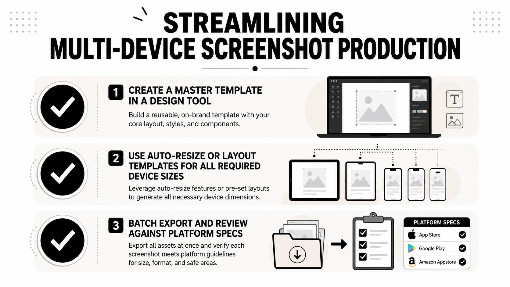
Manual resizing is where screenshot quality breaks. A team creates a strong iPhone gallery, duplicates the files for iPad, changes a few crops, and eventually ships mismatched captions, inconsistent status bars, or UI that's too small to read.
The fix is a structured source file. Build one master layout with separate components for the headline, supporting copy, device render, background, brand mark, and localized text. In Figma, use Auto Layout and component properties so the caption and UI respond predictably when language length changes. Photoshop teams can use Smart Objects and linked layers for the same purpose.
<a id="use-a-master-to-export-workflow"></a>
Use a master-to-export workflow
Start with the largest required source canvas, then adapt layouts rather than blindly scaling them. A portrait iPhone composition may need a genuine iPad adjustment because the additional space changes the visual balance. Android TV and Wear OS assets need their own treatment, not a stretched phone design.
Keep a naming system that records platform, device type, locale, screenshot order, and variant. That sounds administrative, but it prevents the most expensive kind of error, uploading the wrong language or experiment treatment to the wrong listing.
<a id="add-quality-gates-before-submission"></a>
Add quality gates before submission
Run a review pass at three levels:
- Visual review: Check hierarchy, contrast, safe areas, status bars, notch or dynamic island treatment, and UI legibility.
- Product review: Confirm every screen matches the current build, uses non-sensitive data, and shows a flow users can complete.
- Store review: Verify dimensions, formats, screenshot order, localization mapping, and platform-specific policy restrictions.
Batch export only after these checks pass. Automation speeds production, but it doesn't replace judgment. A perfectly exported set can still fail because the caption promises a feature that isn't available in the submitted version.
<a id="running-screenshot-ab-tests-that-actually-inform-decisions"></a>
Running Screenshot A/B Tests That Actually Inform Decisions
Apple's Product Page Optimization tools make screenshot testing accessible, but accessibility doesn't guarantee useful learning. A test becomes informative only when the team knows what changed and why.
Start with a single hypothesis. For example, “A benefit-led first frame will make the app's purpose clearer than a device-only opening.” Keep the rest of the gallery stable if the first-frame message is the variable. If you change the headline, UI screen, background, order, and device frame simultaneously, you may get a winner without knowing which decision caused it.
<a id="prioritize-high-leverage-variables"></a>
Prioritize high-leverage variables
Test in this order:
- First-frame promise, especially benefit versus feature language.
- First-three sequence, because order determines the visitor's initial understanding.
- Proof screen, such as a result, workflow, or differentiating capability.
- Audience or use-case angle, especially for apps serving distinct user groups.
- Localization treatment, including wording, examples, and UI context.
Avoid starting with minor color adjustments or ornamental device frames. Those changes can matter later, but they rarely answer the foundational question: does the visitor understand the app's value?
A separate 2026 benchmark report found iOS impression-to-install around 3.6% to 3.8%, page-view-to-install around 25% to 27%, and a median screenshot-testing lift of 11.8% across hundreds of variants. These figures are reported in ScreenFast's screenshot conversion benchmark, but they shouldn't replace your own baseline. Category, traffic quality, brand familiarity, pricing, reviews, and audience intent all influence conversion.
<a id="read-tests-as-decisions-not-trophies"></a>
Read tests as decisions, not trophies
Before launching, record the current page-view-to-install rate, the traffic source, the tested locales, and the exact creative difference. Afterward, compare equivalent periods and look for consistency across relevant markets. Don't call a result conclusive because the chart moved in the desired direction for a short period.
Apple's framework supports structured comparison, but the interpretation still belongs to the ASO team. A winning screenshot set may improve conversion while attracting a less qualified audience, so review downstream signals such as ratings, retention, and refund or cancellation behavior where available. The best test result is not just the largest lift. It's the clearest evidence that a particular message helps the right users choose the app.
<a id="avoiding-common-rejection-pitfalls-and-submission-errors"></a>
Avoiding Common Rejection Pitfalls and Submission Errors
Most screenshot problems are preventable. The team needs to review the creative as both a marketer and a store reviewer, because a frame can look persuasive while creating a compliance problem.
The first check is truthfulness. Screenshots should show the current app, not a planned feature, an old interface, or a polished concept that users won't encounter after installation. Remove private account data, fake reviews, unsupported awards, misleading rankings, and interface elements that imply functionality the build doesn't provide.
<a id="use-a-preflight-checklist"></a>
Use a preflight checklist
- Verify the build: Open every represented screen in the submitted version and confirm the flow still exists.
- Check claims: Remove absolute promises, unsupported comparisons, and promotional language that the platform may reject.
- Inspect localization: Review translated captions, currency formats, names, screenshots, and line breaks in each priority market.
- Confirm technical files: Validate dimensions, formats, transparency settings, device categories, and screenshot order.
- Review sensitive content: Replace personal information, real financial details, private messages, and identifiable user records with safe test data.
- Prepare reviewer context: If a feature requires a login, special account, location, or setup sequence, explain the access path in the submission notes.
<a id="handle-rejection-messages-precisely"></a>
Handle rejection messages precisely
When a reviewer flags a screenshot, don't respond by changing unrelated assets. Identify whether the issue concerns metadata, misleading representation, privacy, or technical eligibility, then correct the exact frame and update the reviewer notes.
A common submission mistake is allowing the marketing team and product team to work from different UI versions. The screenshot owner may use a design prototype, while the build contains a changed navigation label or missing setting. A final product walkthrough catches that mismatch before review.
The same discipline protects discoverability. Captions should remain readable and accurate enough for users, while the OCR-readable wording should describe genuine app value rather than repeating disconnected keywords. That balance is the core of effective app store optimization screenshots. The gallery must satisfy the algorithm, persuade the visitor, and survive review without making claims the product can't support.
LetsDeployIt prepares app store listing copy and ASO assets, including screenshots for every required device size, and manages submission for React Native and Expo apps across the Apple App Store and Google Play. Visit LetsDeployIt to discuss a launch where screenshot production, compliance checks, reviewer notes, and resubmissions are handled as one workflow.