8 In-App Messaging Best Practices for Better UX
Apply in-app messaging best practices to improve UX, engagement, retention, testing, and delivery in React Native and Expo apps.

More in-app prompts don't automatically create more engagement. They often create the opposite result: users dismiss every interruption, including the one that could have helped them complete an important task. The strongest in-app messaging best practices treat attention as limited. Show the right message to the right user at the right moment, give it one clear action, then measure whether it helped without weakening trust or retention.
That requires more than attractive pop-ups. Mobile teams need a messaging lifecycle that starts with clear content, moves through progressive education and behavioral targeting, controls delivery pressure, respects privacy, and ends with disciplined measurement. Industry summaries citing a 2019 Braze analysis of 29 billion messages reported a 39.88% interaction rate, while a separate study reported a 75% impression rate. Those findings are discussed in the Business of Apps guide to in-app messaging, but they shouldn't be read as permission to maximize volume. Context, relevance, and restraint determine whether the channel remains useful.
The following eight practices apply to established mobile products and to React Native or Expo teams preparing for launch. Each one includes an implementation decision, a trade-off, and a practical way to validate the experience before it reaches every user.
Table of Contents
- 1. Design for clarity and minimize cognitive load in message content
- 2. Use progressive disclosure to guide users through features
- 3. Implement context-aware trigger-based messaging
- 4. Segment users by app lifecycle stage
- 5. Personalize based on user behavior and properties, not demographics alone
- 6. Optimize timing and frequency to prevent message fatigue
- 7. Personalize messages with dynamic content blocks
- 8. A/B test message elements and measure impact on key metrics
- 8 In-App Messaging Best Practices Comparison
- Turn messaging into a measured product system
<a id="1-design-for-clarity-and-minimize-cognitive-load-in-message-content"></a>
1. Design for clarity and minimize cognitive load in message content
A user should understand an in-app message before deciding whether to act on it. Mobile screens offer limited space, and users are usually trying to complete a task rather than read marketing copy. Put the main benefit first, support it with only the context needed to make a decision, and remove anything that competes with the primary action.
A message such as “Start a Channel” is stronger than a paragraph about collaboration followed by several unrelated buttons. Headspace can ask, “Ready to meditate?” and offer a direct path to start, alongside a simple way to defer. Stripe-style onboarding works for the same reason: explain one feature at a time instead of turning the first session into a product catalogue.
<a id="use-one-primary-action"></a>
Use one primary action
The inverted pyramid is a useful writing structure for mobile prompts:
- Lead with value: Tell users what they can accomplish or why the message matters.
- Support briefly: Add the smallest amount of explanation needed to remove uncertainty.
- Limit the choices: Use one primary CTA and one escape option, such as dismiss or later.
- Make hierarchy visible: Use size, weight, spacing, and contrast to show what users should notice first.
A close button isn't a failure. It gives users control and makes the primary action feel like an invitation rather than a trap. Promotional copy should also remain accurate to the destination. A button promising “Export now” shouldn't lead to a settings page that requires several unrelated steps.
<a id="test-comprehension-before-polishing-conversion"></a>
Test comprehension before polishing conversion
Show the message to 5 to 10 people unfamiliar with the app and ask what they think will happen when they tap the primary button. This isn't a conversion experiment. It's a comprehension check. If people interpret the CTA differently, revise the copy before changing colors or animations.
React Native teams should render the same message across small and large screens, different text scaling settings, and both iOS and Android. Check long names, translated strings, safe-area insets, keyboard overlap, and accessibility labels. Clear content also supports a smoother store review because the message's purpose and destination are easier to understand.
<a id="2-use-progressive-disclosure-to-guide-users-through-features"></a>
2. Use progressive disclosure to guide users through features
A first session shouldn't expose every capability at once. Users need a path through the product, not a tour of every screen. Progressive disclosure reveals a feature when the user has enough context to understand its value, often after a meaningful milestone such as creating a project, completing a first task, or inviting a collaborator.
Figma's basic shapes can come before advanced design tools. Notion can introduce databases after a user understands pages. A messaging sequence for WhatsApp might explain status updates, then voice calls, then video calls as those capabilities become relevant. The product teaches through use instead of asking users to memorize an inventory of features.
<a id="map-education-to-readiness"></a>
Map education to readiness
Create a simple progression map before writing campaigns:
- First value moment: Show the action that helps a new user experience the core benefit.
- First repeated behavior: Introduce a shortcut or feature that makes the useful behavior easier.
- First collaboration signal: Surface sharing, comments, or team workflows after the user has something worth sharing.
- Advanced intent: Offer expert features when behavior suggests the user can benefit from them.
Celebrate progress with restrained feedback. A short message after a completed project can acknowledge the achievement and point to the next useful step. It shouldn't turn every successful tap into a confetti animation or another sales prompt.
Users should still be able to find advanced features without waiting for a campaign. Include a visible feature area, search, help entry point, or settings path so experienced users can skip the guided sequence. Progressive education becomes frustrating when it turns into a locked corridor.
For React Native and Expo, keep onboarding state explicit and versioned. A user who has already dismissed a feature tour shouldn't see it again because an app update reset a local flag. Store completion and dismissal events in a reliable account-level system when appropriate, while limiting the data to what the experience needs.
Practical rule: Teach the next useful behavior, not the entire product.
Before launch, ask beta testers to complete common tasks without assistance. If they repeatedly ask where a feature is, improve discoverability or sequencing rather than adding more copy. Clear feature discovery can prevent the kind of “I can't find this” frustration that often appears in negative app reviews.
A guided sequence also needs a human escape route. Users should be able to skip, pause, or revisit education from a help surface instead of being forced through a fixed order.
<iframe width="100%" style="aspect-ratio: 16 / 9;" src="https://www.youtube.com/embed/HGWeDjHHOxc" frameborder="0" allow="autoplay; encrypted-media" allowfullscreen></iframe><a id="3-implement-context-aware-trigger-based-messaging"></a>
3. Implement context-aware trigger-based messaging
A calendar schedules delivery. It does not establish relevance. Trigger-based messaging starts with the user's current action or app state, such as completing a task, leaving checkout unfinished, reaching the first export-ready project, or returning after inactivity.
A PocketGamer.biz summary of that research reported engagement rising from 28% on average to 56% when messages were directly triggered by user actions. That result does not make every trigger effective. It supports a practical starting point: define the useful moment first, then decide whether a message belongs there.
<a id="build-the-event-path-before-the-campaign"></a>
Build the event path before the campaign
Start with 5 to 10 high-impact triggers, and assign each one a single job:
- First completed core action: Recommend the next feature in the same workflow.
- Paused critical flow: Offer help, reassurance, or a route back instead of an unrelated promotion.
- Repeated manual behavior: Show a shortcut when the user repeatedly performs a task that could be automated.
- Meaningful milestone: Present an upgrade or collaboration option only when the user can use it.
- Feature entry without completion: Explain the next step when the user appears stuck.
Eligibility rules prevent accidental interruptions. An “abandoned checkout” event could represent a temporary screen change, so require an incomplete state, a meaningful delay, and no completed purchase before displaying assistance. Add suppression for a recent dismissal, an active support conversation, or another message already shown in the same session. Privacy-conscious targeting also means using only the event and account data required for the experience, with a clear retention policy.
For React Native and Expo, define events in one shared contract rather than creating separate names in JavaScript and native code. Test delivery on iOS and Android across offline recovery, background-to-foreground transitions, and app version changes. If Expo handles the client event and a backend evaluates eligibility, record the same event identifier at both points.
Log the trigger, eligibility decision, display result, CTA action, and dismissal. These records distinguish a weak message from an event that never arrived. They also give product teams a reliable handoff from implementation to later experimentation and measurement.
<a id="4-segment-users-by-app-lifecycle-stage"></a>
4. Segment users by app lifecycle stage
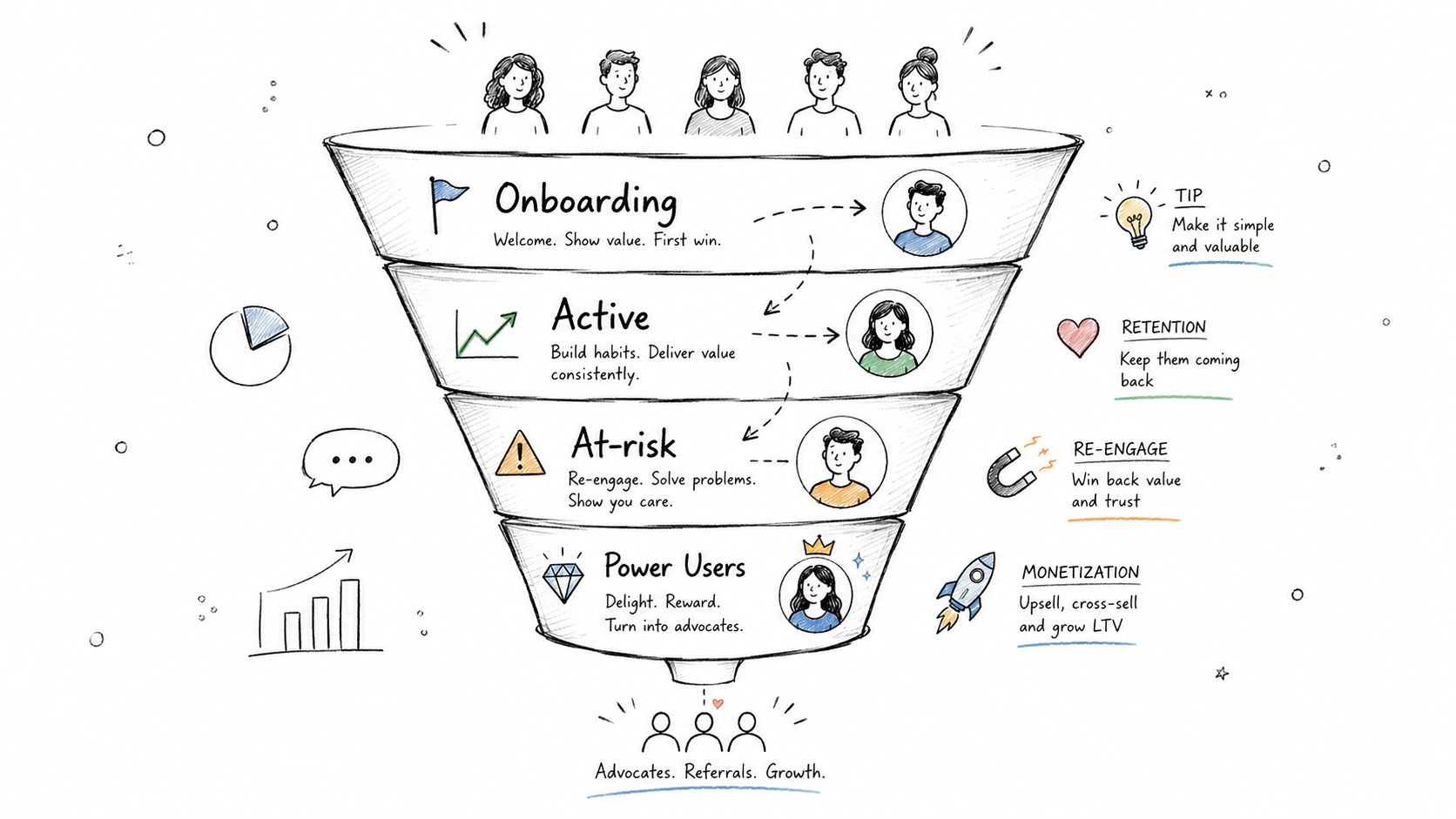
A new user opening an app for the first time needs orientation. An active user may be ready to discover another feature. Someone whose activity is declining may need help returning to an unfinished goal, while a power user may benefit from advanced workflows or a paid plan. A single prompt cannot serve all four situations well.
Use a compact lifecycle model tied to observable behavior: new, active, at-risk, and power users. Slack might show workflow guidance to a new workspace member, then surface advanced collaboration tools after repeated use. Spotify can address an inactive listener differently from someone who regularly creates playlists. These stages describe the user's relationship with the product, not a fixed identity.
| Lifecycle stage | Useful signal | Message focus |
|---|---|---|
| New user | Core setup remains incomplete | Orientation and the next meaningful action |
| Active user | Recent use of a central feature | Feature discovery or a more efficient workflow |
| At-risk user | Declining activity plus an unfinished goal | Help that supports the pending task |
| Power user | Repeated use of advanced capabilities | Depth, efficiency, or an appropriate paid path |
<a id="set-entry-and-exit-rules-from-product-events"></a>
Set entry and exit rules from product events
Keep the first version narrow. Give every segment a clear purpose, an owner, and a message policy. Define entry and exit conditions so users move between stages automatically rather than remaining in an outdated bucket. Review whether a segment changes the experience or a product decision, and retire it when it does neither.
Prioritize onboarding and feature discovery at launch. New users need to reach product value before an upgrade prompt is relevant. During post-launch monitoring, compare dismissal patterns, support questions, and progress through core actions by lifecycle stage. A message click alone cannot show that the broader lifecycle is healthy, because store ratings reflect the entire experience.
For React Native and Expo, evaluate segments on the server or in a customer engagement platform, then send the app only the campaign decision and approved content. This keeps targeting logic out of duplicated client and native implementations and lets the team adjust rules without shipping a new binary. Keep identifiers pseudonymous where possible, limit attributes to those required for the experience, and document retention and deletion behavior before launch.
<a id="5-personalize-based-on-user-behavior-and-properties-not-demographics-alone"></a>
5. Personalize based on user behavior and properties, not demographics alone
Choose properties that explain the user's relationship with the product and the action a message should support. Demographics such as age or location can add broad context, while event properties usually provide more actionable detail: feature used, workflow completed, subscription status, device type, and time since a key action.
The data model matters more than the persona label. Store an event such as draft_created with properties like feature name, completion state, and last updated time. A message can then respond to a concrete product state without relying on assumptions about the user.
Use a small property set with clear ownership:
- Event properties: What happened, where it happened, and whether the task was completed.
- Account properties: Subscription tier, payment status, or permissions that affect available actions.
- State properties: Current progress, recent activity, or eligibility for a product experience.
- Data controls: Collection purpose, retention period, deletion behavior, and access restrictions.
Avoid collecting a property just because the SDK makes it available. Sensitive attributes should not appear in copy unless the user has a clear reason to see them. “Continue your draft” can provide useful direction without exposing private draft details.
Property selection also creates trade-offs. More fields can improve targeting, but they increase event volume, schema maintenance, review work, and privacy exposure. A lean schema is easier to validate across mobile clients and reduces inconsistent behavior between releases.
For React Native and Expo, define event names and property types in a shared tracking contract. Send events through the analytics SDK, then evaluate eligibility in the service that controls campaigns. The app should receive the approved decision and content, rather than embedding separate targeting rules in JavaScript and native code. Keep identifiers pseudonymous where possible, and test missing or stale properties before enabling a campaign.
Compare a behavior-based rule with a broad audience or simpler control. Measure whether the selected properties improve message relevance or downstream product action enough to justify their implementation and privacy cost. The goal is selective personalization, not a larger data model.
<a id="6-optimize-timing-and-frequency-to-prevent-message-fatigue"></a>
6. Optimize timing and frequency to prevent message fatigue
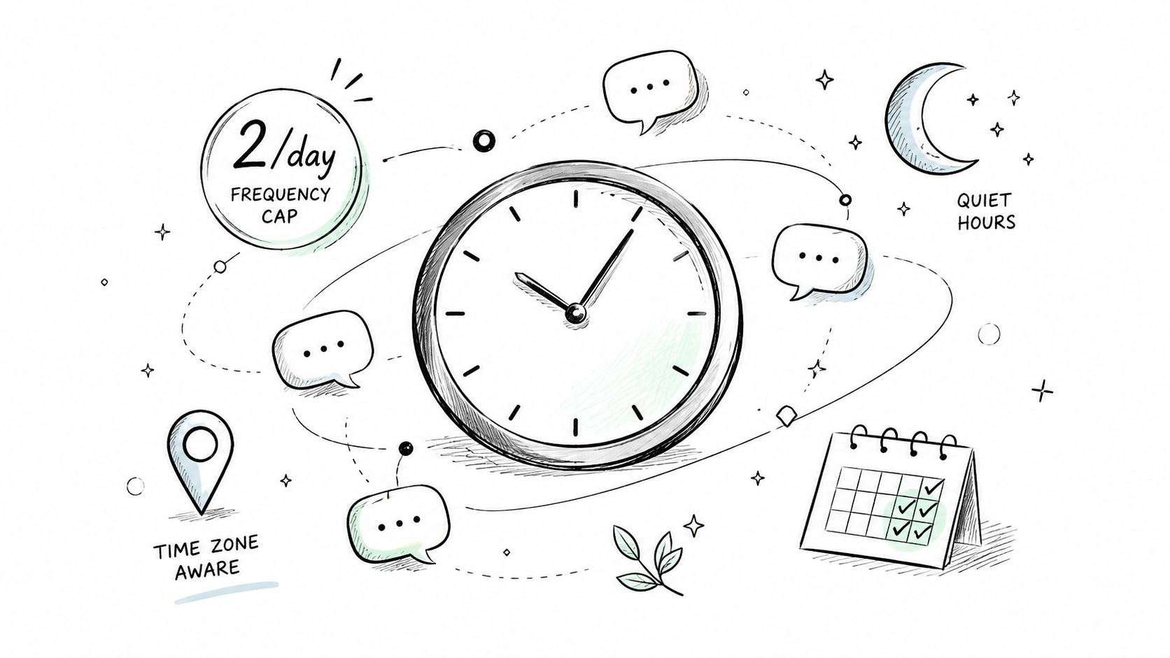
A relevant message can still interrupt the wrong task. Set delivery rules around the user's current context, then apply local time, quiet periods, and coordination with other channels. Frequency needs a separate policy because several relevant campaigns can compete for the same session.
Practical guidance on session-level in-app notification controls recommends starting with one to two in-app messages per session and adding suppression windows. Validate that policy against your product rather than treating it as universal. A banking confirmation may take priority over a feature announcement, while a low-priority promotion can wait after the user has already received onboarding guidance.
Use a priority queue whenever multiple campaigns qualify:
- Critical utility: Show information required to complete or understand an active transaction.
- Contextual assistance: Address the current workflow or a visible point of friction.
- Education: Introduce a feature connected to recent behavior.
- Promotion: Present an upgrade or commercial prompt only when it does not displace higher-value help.
The queue should make one deterministic decision. Record impressions by campaign and session, respect dismissals, and suppress a message after display. Prevent navigation from replaying the same prompt when a screen remounts. In React Native, a central message coordinator can check eligibility, priority, session budget, and the current route before rendering. Expo teams can keep campaign decisions in the coordinator rather than duplicating rules across screens.
Use a short sentence to define the handoff: an in-app message should help with a task the user can complete in the current session.
Quiet hours and time zones become more important when push, email, or SMS support the same campaign. Push can re-engage an absent user, while email can provide longer explanation. The RapidNative guidance on in-app messaging orchestration supports coordinating channels around privacy-aware relevance instead of running isolated campaigns. For implementation, store suppression state server-side when users move between devices, and keep consent and channel preferences in the eligibility check.
Frequent dismissals do not automatically mean the copy needs rewriting. Check arrival timing, campaign conflicts, and whether the requested action is available yet. Test those conditions before increasing frequency or changing the message.
<a id="7-personalize-messages-with-dynamic-content-blocks"></a>
7. Personalize messages with dynamic content blocks
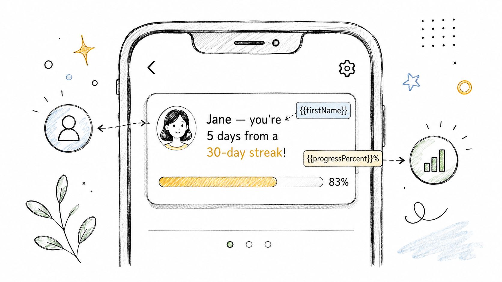
Dynamic content should help users decide what to do next. A progress value, recent action, achievement, or saved state can connect the message to the current product experience. The benefit comes from relevance, not from adding a first name to every sentence.
A language app can reference a user's current learning streak. A fitness product can show progress toward a selected goal. An e-commerce app can welcome a returning shopper with recommendations based on prior activity. These examples require accurate data and clear context, so users understand why the app is showing the information.
Choose content that supports the immediate task:
- Progress: Show what remains to reach a goal or finish setup.
- Recent action: Point to an unfinished task the user can resume.
- Achievement: Recognize a meaningful milestone without demanding another action.
- Plan context: Explain which capability the user's subscription includes or limits.
- Device context: Adjust instructions when platform behavior differs.
Keep values current and easy to verify. A stale progress value can send users back into a completed flow, while a missing field should fall back to safe static copy. Define those fallbacks before launching a campaign.
Privacy affects the presentation as much as the data source. Sensitive information displayed on a shared screen can reduce trust, even when the app collected it lawfully. Use neutral language, explain relevant data practices in the privacy experience, and provide personalization controls where appropriate.
For Expo and React Native, decide where each block is resolved. Server-rendered content allows campaign changes without an app release, but the client must handle missing fields, stale values, long strings, offline sessions, and incompatible campaign versions. Local rendering provides faster, more predictable output, but campaign logic becomes tied to release cycles. A hybrid design often fits mobile teams: the server selects the campaign and approved parameters, while the app renders a tested native or React Native component.
Test dynamic and static variants under the same eligibility rules. If the personalized version performs worse, check data freshness, fallback behavior, and message relevance before rejecting personalization. A wrong progress value is worse than no progress value.
<a id="8-ab-test-message-elements-and-measure-impact-on-key-metrics"></a>
8. A/B test message elements and measure impact on key metrics
Treat in-app messaging as a product surface that requires ongoing testing. Compare the elements users directly experience, such as the headline, CTA, visual treatment, placement, timing, and eligibility. Connect each test to the product outcome the message is intended to influence.
Use a controlled comparison built around one hypothesis rather than borrowed benchmarks. A feature-discovery message may target feature completion, while an onboarding prompt may support progress through core setup. Evaluate promotional prompts against downstream product and business outcomes, not clicks alone.
<a id="start-with-one-decision-then-define-the-evidence"></a>
Start with one decision, then define the evidence
Change one primary variable in the first experiment:
- Headline: Does a benefit-led statement outperform a feature label?
- CTA: Does “Try export” clarify the next step better than “Learn more”?
- Format: Does a contextual tooltip work better than a modal?
- Timing: Does showing the prompt after completion outperform showing it on entry?
- Audience: Does behavior-based targeting outperform a broad lifecycle segment?
Before launch, specify the exposure event, action event, and guardrail events. Track dismissals, repeated sessions without progress, support contacts, and retention where they fit the campaign. A message may increase taps while weakening the workflow around it.
Give every campaign a stable identifier and every variant its own identifier. Record eligibility, display, dismissal, CTA tap, destination success, and the downstream outcome. In React Native, confirm that analytics fire once when components remount. Test process death, navigation changes, offline return, and app upgrades as well.
Expo teams should keep experiment assignment and event logging consistent across development and production builds. If targeting or content is server-controlled, define a safe default variant for unavailable configuration or stale assignments. That keeps the experience usable while preserving a valid control group.
Run tests long enough to reflect normal usage, but remove a harmful variant before a planned schedule ends. Small audiences support directional findings, not confident conclusions. Record the hypothesis, implementation, result, and follow-up in the team's experiment log. Over time, this record gives product teams a reliable basis for the next message decision.
<a id="8-in-app-messaging-best-practices-comparison"></a>
8 In-App Messaging Best Practices Comparison
| Strategy | Implementation Complexity 🔄 | Resource Requirements ⚡ | Expected Outcomes ⭐📊 | Ideal Use Cases 💡 | Key Advantages ⭐ |
|---|---|---|---|---|---|
| Design for Clarity and Minimize Cognitive Load in Message Content | Low–Medium, clear rules, consistent design system | Low, designer + copy + QA; minor dev adjustments | ⭐⭐⭐⭐, higher conversion & comprehension, fewer rejections | Mobile CTAs, onboarding screens, app-store preview content | Clear intent, better conversions, mobile-friendly |
| Use Progressive Disclosure to Guide Users Through Features | Medium–High, plan sequences and milestone triggers | Medium, product mapping, interactive UI, analytics | ⭐⭐⭐⭐, improved feature adoption and reduced overwhelm | Complex apps, guided onboarding, staged feature teaching | Stepped learning, higher adoption, reduced support |
| Implement Context-Aware Trigger-Based Messaging | High, event tracking and conditional logic | High, robust analytics, event pipelines, engineering | ⭐⭐⭐⭐⭐, very high relevance and conversion when timely | Checkout recovery, critical flows, behavior-driven nudges | Timely relevance, higher conversion, interruption reduction |
| Segment Users by App Lifecycle Stage | Medium, define segments and dynamic rules | Medium, analytics, segmentation tooling | ⭐⭐⭐⭐, better retention, targeted messaging, LTV lift | Post-launch retention, churn prevention, monetization | Tailored messages per stage, reduced churn, testable segments |
| Personalize Based on User Behavior and Properties, Not Demographics Alone | High, behavioral models and ongoing data refresh | High, tracking, data engineering, privacy controls | ⭐⭐⭐⭐⭐, significantly higher engagement & monetization | Recommendations, upsells, feature targeting by usage | Predictive personalization, higher conversions than demographics |
| Optimize Timing and Frequency to Prevent Message Fatigue | Medium, scheduling, caps, timezone logic | Low–Medium, scheduling + analytics to tune cadence | ⭐⭐⭐⭐, lower uninstall rates, better conversion per message | New app launches, reminder systems, time-sensitive alerts | Reduces fatigue/uninstalls, preserves ratings and sentiment |
| Personalize Messages with Dynamic Content Blocks | Medium–High, templating + conditional rendering | Medium, clean data, real-time pulls, QA | ⭐⭐⭐⭐⭐, typical 2–3x engagement lift vs static messages | Progress updates, achievement nudges, personalized offers | Scalable personalization, stronger user-brand connection |
| A/B Test Message Elements and Measure Impact on Key Metrics | Medium, experiment setup and significance analysis | Medium–High, analytics, sample size, dashboards | ⭐⭐⭐⭐, iterative, evidence-based improvement over time | Copy/CTA optimization, timing tests, visual variants | Data-driven decisions, compounding gains, removes guesswork |
<a id="turn-messaging-into-a-measured-product-system"></a>
Turn messaging into a measured product system
The eight practices work best as one operating system. Begin with a message design system that defines typography, spacing, button behavior, dismissal patterns, accessibility states, tone, and approved formats. A design system reduces inconsistency, but it shouldn't force every situation into the same modal. Use a banner for ambient information, a tooltip for a focused hint, and a more interruptive surface only when the user needs to respond.
Next, instrument the product before expanding campaigns. Define lifecycle states, behavioral events, feature milestones, message identifiers, and outcome events. Localytics reporting helped establish the importance of behavioral triggers, while the broader Business of Apps evidence on in-app messaging connects the channel with retention and app-launch differences. Those findings are useful context, but your product's event data should decide which messages earn continued delivery.
Launch a small set of contextual campaigns first. A new user might receive guidance after entering the core workflow. A returning user might see help for an unfinished task. A power user might receive an advanced shortcut. Add a central coordinator that handles priority, session budgeting, suppression, route readiness, and channel ownership. Don't let separate screens compete to display independent prompts.
Privacy belongs in the implementation plan, not in the final review. Document the data used for targeting and dynamic content, collect only what the experience requires, provide consent or preference controls where applicable, and avoid putting sensitive information into visible message copy. Coordinate in-app messaging with push, email, and SMS so users don't receive duplicate requests or contradictory instructions.
<a id="react-native-and-expo-launch-checklist"></a>
React Native and Expo launch checklist
Before release, verify:
- Cross-platform rendering: Test iOS and Android layouts, safe areas, text scaling, dark mode, localization, and accessibility.
- Version behavior: Confirm that campaign schemas, dismissal state, event names, and deep links work across supported app versions.
- Analytics events: Validate exposure, dismissal, CTA, destination completion, and downstream outcome events without duplicate logging.
- Privacy handling: Review consent, data minimization, retention, personalization controls, and visible content for sensitive data.
- Delivery controls: Test session caps, suppression windows, priority rules, quiet hours, time zones, and cross-channel exclusions.
- Release validation: Check production configuration, signing, deep links, fallback content, offline behavior, and store reviewer notes.
LetsDeployIt can help React Native and Expo teams prepare the surrounding launch work, including store listing copy, ASO keywords, screenshots, app icon polish, preview video, privacy policy and Terms hosting, compliance checks, reviewer notes, and Google Play data safety preparation. The service manages submission and resubmissions, while the product team should retain ownership of event design, campaign governance, privacy decisions, and ongoing measurement.
The best in-app messaging program becomes quieter as it becomes smarter. It removes irrelevant prompts, reserves attention for moments where users can act, and uses evidence to improve the product rather than increasing message volume.
LetsDeployIt prepares and submits React Native and Expo apps for Apple App Store and Google Play review, including the store assets, privacy documentation, compliance work, and EAS Build and Submit wiring that can delay a messaging-ready launch. Visit LetsDeployIt to get launch support while your product team keeps control of messaging strategy, privacy guardrails, analytics, and experimentation.