Mobile App Competitive Analysis: A Practical Playbook
Run a sharper mobile app competitive analysis with our step-by-step playbook. Covers ASO, UX benchmarking, retention signals, and launch-ready templates.

You can usually feel the problem before you can name it. The team has already spent weeks wiring up the core flows in React Native, the mockups look decent, and the backlog is full of feature work. Then someone opens the App Store or Google Play, runs the same search terms, and finds a competitor that already owns the niche, speaks to the same user, and has been iterating in public for months.
That's where mobile app competitive analysis matters most. Not after launch, when the deck is already stale, but before code hardens into assumptions. The best teams use it to decide what to build, what to skip, how to position, and where they can still win with a better package, better onboarding, or a sharper monetization model.
The market pressure behind that discipline is real. The global mobile application market was valued at USD 252.89 billion in 2023 and is projected to reach USD 626.39 billion by 2030, implying a 14.3% CAGR from 2024 to 2030, according to Grand View Research. In a market growing that fast, a small edge in keyword ranking, retention, or pricing can separate a useful product from one that never gets seen.
Table of Contents
- Why Most Teams Run Competitive Analysis Too Late
- Building Your Three-Tier Competitor Set
- Dissecting Store Listings and ASO Signals
- Benchmarking UX, Features, and Technical Signals
- Mining Reviews, Retention, and Monetization Signals
- Finding White Space Beyond the Feature Race
- Turning the Analysis Into a Launch-Ready Deliverable
<a id="why-most-teams-run-competitive-analysis-too-late"></a>
Why Most Teams Run Competitive Analysis Too Late
A common failure pattern starts with enthusiasm and ends with sunk cost. A React Native team picks a problem, sketches the onboarding, and ships into development before anyone has mapped the competitor environment in a disciplined way. Six weeks later, someone notices that a rival launched the same core feature last quarter, already ranks for the obvious keywords, and has a review trail full of user pain the team never saw.
That's not a research problem. It's a sequencing problem.
<a id="competitive-analysis-should-shape-the-build-not-decorate-it"></a>
Competitive analysis should shape the build, not decorate it
The useful version of mobile app competitive analysis doesn't produce a vague “market overview.” It produces decisions. It tells you whether your roadmap should lean into a different user segment, whether your store listing should target a narrower keyword cluster, whether your pricing needs to be freemium instead of subscription-first, and whether the product should emphasize speed, trust, or workflow depth.
The output should be concrete artifacts, not a slide deck that dies in a folder. A good analysis leaves behind a competitor roster, a keyword map, a review complaints matrix, a feature and UX matrix, and a set of positioning hypotheses that engineering, ASO, and marketing can use.
Practical rule: if the analysis doesn't change a build decision, a store asset, or a monetization choice, it was probably too shallow.
<a id="the-three-mistakes-that-keep-repeating"></a>
The three mistakes that keep repeating
The first mistake is treating competitive analysis like a one-time download dump. Teams grab a few screenshots, compare feature lists, and stop there. That misses the part that matters most, which is how competitors evolve their metadata, how their reviews change, and which friction points keep showing up in support.
The second mistake is copying the obvious leader. The category champion is useful, but it's not enough. You also need the direct challenger, the indirect substitute, and the aspirational benchmark, because each one teaches you something different about user expectations and market pressure.
The third mistake is ignoring reviews and support channels. That's where the market says what the product copy won't. If you don't read recent complaints, you miss onboarding friction, accessibility gaps, localization problems, and feature requests that multiple competing apps are already hearing in public.
<a id="building-your-three-tier-competitor-set"></a>
Building Your Three-Tier Competitor Set
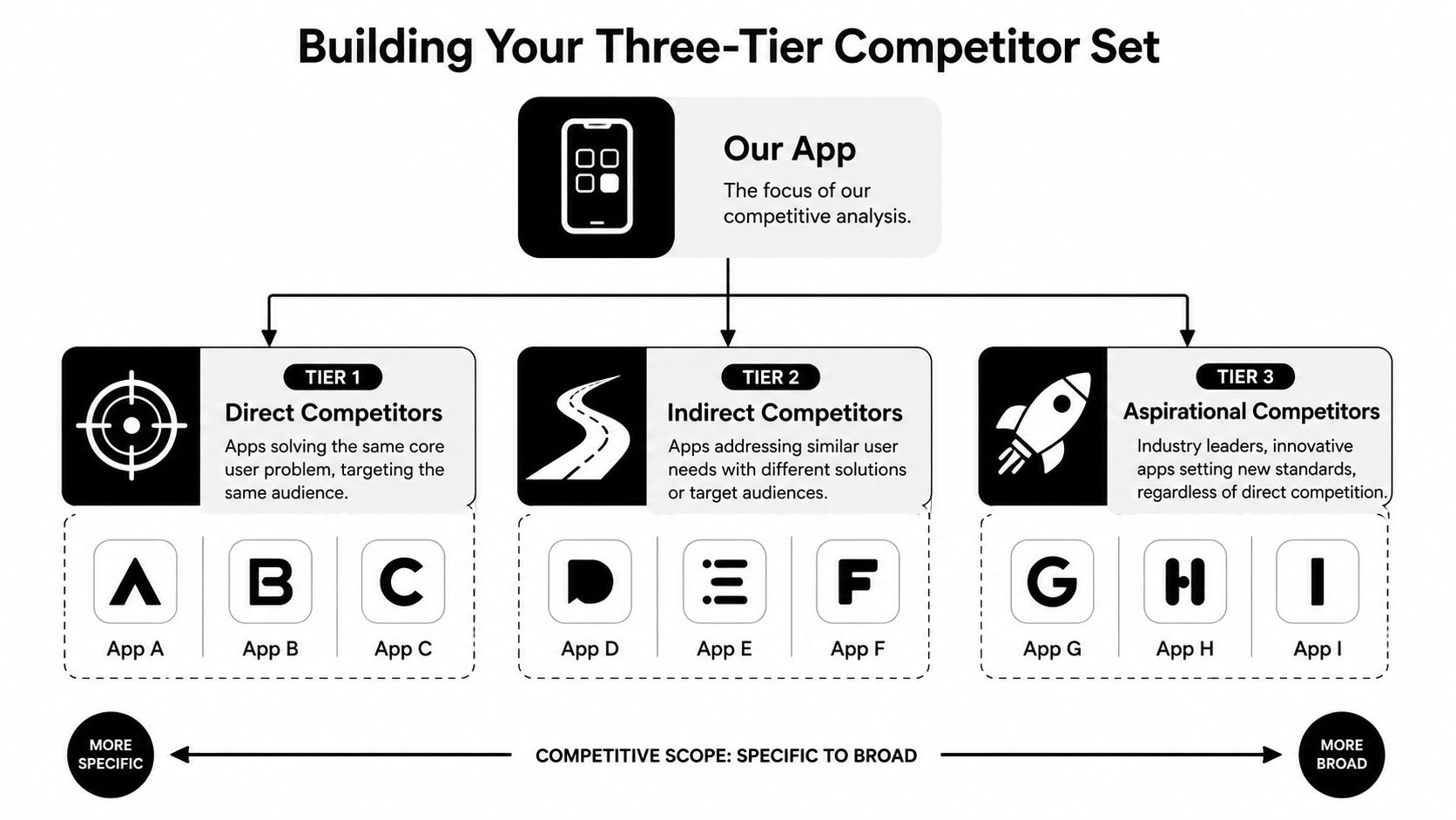
A usable competitor set starts with one question, not twenty apps. Ask, “Who is really competing for the same user action, the same keyword, or the same budget?” Once that's clear, split the field into direct, indirect, and aspirational competitors. That structure keeps the analysis honest and keeps the team from wasting time on shiny but irrelevant apps.
<a id="use-overlap-not-fame-as-the-selection-filter"></a>
Use overlap, not fame, as the selection filter
Direct competitors solve the same core problem for the same audience. If you're building a budgeting app for young professionals, another budgeting app with the same user promise belongs here.
Indirect competitors solve the same job differently. A budgeting app may compete with a banking app's built-in analytics, a spreadsheet template, or a cash-flow tracker. Users compare those options whether the category labels match or not.
Aspirational competitors don't need to be in your category at all. They set the UX bar, the monetization bar, or the store presence bar. A productivity app might study top-tier consumer apps for onboarding clarity or visual hierarchy even if the use case is different.
The easiest rubric is blunt. Keep apps that overlap on audience, monetization model, keyword footprint, or review volume, then trim the list until each tier has only a few real contenders. Senior product marketers often keep the set small on purpose, because a focused roster is easier to maintain than a bloated one.
Useful cutoff: if an app doesn't influence your keyword strategy, your feature roadmap, or your user expectations, it probably doesn't belong in the core set.
<a id="build-the-roster-in-a-shared-sheet"></a>
Build the roster in a shared sheet
A good shared sheet should have one row per competitor and a short thesis for why it's there. Include the app's category, the primary user segment it appears to target, the keywords it seems to own, the monetization model, and one sentence on why it matters to your launch.
For example, a meditation app team might keep one direct competitor that targets sleep, one indirect competitor that sells breathing exercises through a different brand story, and one aspirational app known for elegant onboarding. That gives the team more signal than a random list of “apps like ours.”
Keep the roster tight. A practical cap is three to five competitors per tier, because a short list gets reviewed monthly, while a long one gets ignored. The best set is small enough to update without meetings and rich enough to show patterns.
<a id="dissecting-store-listings-and-aso-signals"></a>
Dissecting Store Listings and ASO Signals
The store listing is the public version of the product strategy. It tells you what the team thinks users care about, what keywords they're chasing, and how they're trying to convert a search result into an install. If you only compare icon design and a few screenshots, you're missing the signal.
<a id="capture-the-whole-storefront-not-just-the-headline"></a>
Capture the whole storefront, not just the headline
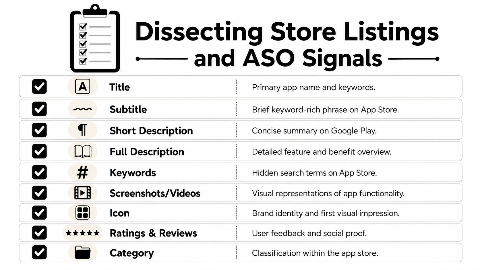
For each competitor, track the title, subtitle, short description, first three description lines, screenshot sequence, preview video, icon, category, and ratings volume plus average rating. That set covers both discoverability and conversion. It also makes month-over-month changes obvious, which is where the most useful ASO clues show up.
Apple and Google don't surface all the same fields, so the audit needs to be platform-aware. On iOS, the subtitle and keyword field matter a lot. On Google Play, the short description and first lines of the long description do more work. The point isn't to memorize store rules, it's to notice which text blocks a competitor is clearly using to push a new term or reposition the app.
A high-signal audit doesn't happen once. It gets repeated monthly, with changes logged in a shared sheet. If a competitor rewrites the subtitle, rotates the first screenshots, or changes the preview video around a seasonal campaign, that's not random. It usually means they're testing a new keyword cluster, targeting a new user segment, or responding to a ranking move.
<a id="watch-for-deliberate-aso-pushes"></a>
Watch for deliberate ASO pushes
A competitor that suddenly climbs on a keyword isn't always winning by luck. Sometimes it's a coordinated push through metadata, sometimes paid acquisition, and sometimes a shift in creative messaging. The useful habit is to flag any keyword where a competitor is moving up fast, then inspect whether the listing changed at the same time.
Also look at localization coverage. If your market includes multiple languages, check whether competitors localize the title, subtitle, screenshots, and description, or whether they're just translating mechanically. The difference matters, because search intent changes by market and weak localization often creates room for a smaller team to outrun a bigger one.
The same applies to in-app purchases and paywalls. If a competitor's store page signals one thing and the app itself monetizes another way, note the mismatch. Those mismatches are often where user frustration starts.
A clean listing audit tells you what the competitor wants users to believe. A delta log tells you what they're trying to fix.
<a id="benchmarking-ux-features-and-technical-signals"></a>
Benchmarking UX, Features, and Technical Signals
Store listings can overpromise. The app itself tells you whether the promise holds up. That's why a serious mobile app competitive analysis needs a teardown of the actual user journey, not just a marketing comparison.
<a id="score-the-experience-not-just-the-feature-count"></a>
Score the experience, not just the feature count
The fastest way to keep the review usable is to score each competitor on a simple 1-5 rubric across a few dimensions. Observe time to first value, onboarding steps, permissions requested, depth of customization, offline behavior, accessibility support, and how cleanly the app handles the edge cases users mention in reviews.
A sample matrix can stay small and still be useful:
| Dimension | What to observe | Score 1-5 | Notes |
|---|---|---|---|
| First-run flow | How quickly a user reaches value | ||
| Onboarding | Guided tour, account creation, friction points | ||
| Core workflow | Number of taps to complete the main job | ||
| Customization | Options, templates, personal controls | ||
| Accessibility | Labels, contrast, text scaling, screen reader support | ||
| Edge cases | Error handling, empty states, offline behavior |
The point is not to turn product judgment into theater. It's to make side-by-side comparison fast enough that your team can discuss it.
<a id="read-technical-signals-where-they-matter"></a>
Read technical signals where they matter
Not every app needs a deep architecture investigation, but some technical signals are worth checking. Similarweb's app intelligence product shows how broad the modern view has become, with fields like DAU, WAU, MAU, sessions, day-1/day-7/day-30 retention, revenue, ratings, reviews, and SDK data across 2,800 SDKs in 32 categories exposed as part of app intelligence workflows, according to Similarweb.
That matters because the old “feature checklist” approach misses the operating system underneath the app. If a competitor carries a heavy SDK footprint, leans on many third-party trackers, or seems to ship through a cross-platform stack that leaves visible UI rough edges, those clues affect your own build-vs-buy thinking. They also affect expectations around speed, instrumentation, and release velocity.
Don't over-read architecture from the outside. Use it as context, not gospel. The point is to understand why one competitor ships polished flows quickly while another seems stuck cleaning up the same rough edges.
<a id="mining-reviews-retention-and-monetization-signals"></a>
Mining Reviews, Retention, and Monetization Signals
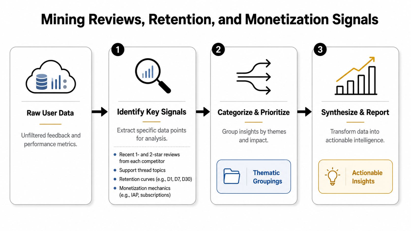
The highest-value signal in competitive research usually sits where teams are lazy, in reviews, support threads, retention behavior, and monetization structure. Feature lists tell you what an app claims to do. User complaints and revenue mechanics tell you what's working.
<a id="turn-complaints-into-a-matrix"></a>
Turn complaints into a matrix
Start with the most recent one- and two-star reviews from each competitor. Group them by theme, not by app. If multiple apps get hit for onboarding confusion, sync failures, pricing confusion, or support delays, you've found a recurring complaint pattern rather than an isolated bug.
That complaint matrix is more useful than a generic SWOT grid because it's grounded in user language. It shows what people are frustrated by, what they praise despite flaws, and where the market tolerates inconvenience because no one has solved the problem cleanly yet.
Support forums and help-center comments matter for the same reason. They often surface issues that don't make it into polished app store descriptions. If users keep asking the same question, the market is telling you something the product page is hiding.
<a id="read-retention-and-monetization-together"></a>
Read retention and monetization together
Retention and monetization need to be interpreted as a pair. A product can look strong on downloads and still be weak if users churn quickly. Another app can keep users engaged but fail to monetize because the paywall is poorly timed, the tiers are too blunt, or the ad load is misaligned with the value proposition.
Modern competitive analysis frameworks track downloads, rankings, retention, revenue, ratings, reviews, and monetization because the combination reveals both momentum and satisfaction, and tools like Similarweb surface those signals directly in app intelligence workflows, as noted above. Similar third-party estimates, such as keyword rankings, review counts, and download estimates from tools like Sensor Tower or AppMagic, are useful when you need to compare competitors on market position and overlap with your target user.
A practical reading habit helps here. If a competitor is climbing on a keyword and recent reviews mention the same feature gap, that's a strong sign of a deliberate push into a new user intent. If the app gets praised constantly but still monetizes weakly, you may be looking at an under-priced or under-packaged opportunity.
Practical rule: don't separate growth from monetization. The strongest opportunities usually show up where engagement is healthy and the business model is still sloppy.
<a id="finding-white-space-beyond-the-feature-race"></a>
Finding White Space Beyond the Feature Race
A crowded category doesn't always mean a closed category. It often means the obvious battle is already over, and the opening sits somewhere less glamorous, like pricing, regional fit, accessibility, or a workflow shortcut no one has bothered to polish. That's the part most guides miss when they keep pushing feature parity as the answer.
<a id="look-for-market-pockets-not-just-missing-features"></a>
Look for market pockets, not just missing features
The mistake is assuming that the winning move is always “build more.” In practice, many categories already have enough features. What they lack is a cleaner package, a better price point, a stronger local version, or a tighter path from problem to outcome.
A complaints matrix and a monetization review start paying off. If several competitors in the same category bundle similar features into the same subscription shape, the category may be crowded in the wrong place. A different packaging model, a lighter entry tier, or a region-specific offer can be a stronger move than adding yet another tab to the UI.
The same logic applies to geography. Some markets are crowded in the U.S. and under-served elsewhere. If a competitor is strong in one region but weak in another, that's not a trivia fact, it's a signal that local keywords, localization quality, and support expectations may still be open territory.
<a id="prioritize-friction-the-market-keeps-repeating"></a>
Prioritize friction the market keeps repeating
Recent app-analysis guidance points to localization, accessibility, and integration gaps as recurring missed opportunities, and that's been true in practice as well. Teams often spend weeks polishing a visible feature while ignoring the boring operational pain that users complain about every day.
A useful priority filter is simple:
- Localization gaps if users search and read in more than one language, and competitors still feel translated instead of local.
- Accessibility gaps if the category is broadly useful but still awkward for screen readers, larger text, or high-contrast use.
- Workflow gaps if users complain that the core job takes too many steps or fails in edge cases.
- Packaging gaps if competitors monetize well but don't match the way users want to pay.
That combination gives you a defensible white-space thesis. It doesn't require guessing that your app should be the most feature-rich. It only requires proving that the market is still leaving some users behind.
<a id="turning-the-analysis-into-a-launch-ready-deliverable"></a>
Turning the Analysis Into a Launch-Ready Deliverable
Competitive analysis only matters when it lands in the hands of the people shipping the product. A pretty spreadsheet is useless if it never changes a screenshot, a keyword target, or a roadmap decision. The deliverable needs to be something that can survive a planning meeting.
<a id="ship-the-analysis-as-a-working-set-of-artifacts"></a>
Ship the analysis as a working set of artifacts
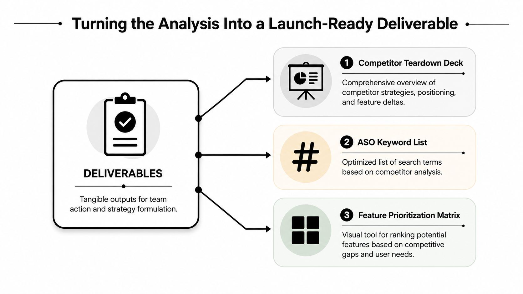
The core package should include a competitor teardown deck, an ASO keyword list, and a feature prioritization matrix. The deck should cover category context, the three-tier competitor overview, store listing teardown, UX and feature comparison, monetization and retention read, the white-space hypothesis, and the recommended bets.
The keyword list should feed directly into metadata planning, especially titles, subtitles, and any store-specific keyword field. The feature matrix should rank potential work by competitive gap and user need, so the team can avoid building low-value parity features just because a rival has them.
A live tracking sheet should sit beside the deck, not replace it. Use it for monthly changes in store copy, screenshots, reviews, and rating trends. Use a second tab for the complaints matrix, so support themes and app-store sentiment don't get buried in the same table as keywords.
Keep the deck short enough that people read it twice, not once. The analysis gets ignored when it feels like homework.
<a id="tie-the-output-to-a-launch-cadence"></a>
Tie the output to a launch cadence
A useful refresh rhythm is monthly for store signals and review themes, then deeper review before major releases or regional expansions. That cadence keeps the analysis from going stale without turning it into busywork.
The handoff should be explicit. Product owns the feature bets. ASO owns the metadata and creative implications. Marketing owns the positioning and message hierarchy. If one person owns the whole bundle, the launch gets clearer faster.
For teams using a launch partner workflow, the practical next step is to turn the research into store assets, reviewer notes, and submission-ready copy. That's where the analysis stops being an audit and starts becoming the launch plan.
If you want this kind of analysis turned into launch-ready store assets, review notes, and submission support without the usual back-and-forth, visit LetsDeployIt. They specialize in getting React Native and Expo apps through App Store and Google Play review with the metadata, screenshots, compliance pieces, and submission work already aligned to what the stores expect.