App Store Optimization Icon: Design Rules and Testing
A practical guide to app store optimization icon design: specs for Apple and Google, A/B testing, conversion data and compliance risks.

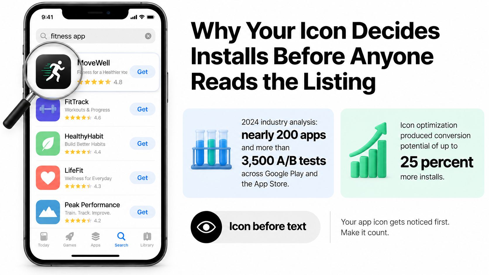
A searcher decides on your app before they read a word of the listing. A 2024 industry analysis covered by International Accounting Bulletin looked at nearly 200 apps and more than 3,500 A/B tests across Google Play and the Apple App Store, and icon optimization produced conversion potential of up to 25% more users. The same analysis found that icons with clear, simple backgrounds generated conversion increases of more than 26% across categories. Treat the icon as a testable acquisition asset, not a logo you freeze on day one.
Table of Contents
- Why Your Icon Decides Installs Before Anyone Reads the Listing
- Icon Sizes and File Specs for Apple and Google Play
- Icon Design Rules That Hold Up at Thumbnail Size
- Icon Compliance Risks That Trigger Rejections
- How to A/B Test Icon Variants Step by Step
- Run Your Icon Checklist Before You Submit
<a id="why-your-icon-decides-installs-before-anyone-reads-the-listing"></a>
Why Your Icon Decides Installs Before Anyone Reads the Listing
In search results, category charts, and related-app rows, the icon is on screen while the description is still below the fold. Screenshots may peek in. The symbol is what the eye locks onto when several apps share a keyword. Listing copy only gets a read after that glance holds.
The icon works like a shop window. It decides whether someone walks in. The listing is the shelf inside, useful only after that first step. Treat the file as a conversion lever and as a trust asset: a muddy or copied mark looks less legitimate than a plain one, even when the rest of the listing is careful.
Color is not a universal rule, and finance listings show why. Bold colors have lifted conversion for some finance apps when they appear in icons and screenshots. Blue shows up often among leading finance icons. Red has helped conversion in certain markets, including China. A palette that helps one category in one country can sit flat somewhere else. Simplicity traveled further than any single hue.
<a id="three-jobs-before-the-tap"></a>
Three jobs before the tap
An app store optimization icon has to do three jobs at once. A design that only does one of them leaks installs.
- Stay recognisable when it is tiny. Search rows shrink artwork until fine detail turns into noise. One shape should still name the app.
- Signal the category at a glance. A chart, a shield, a controller, or a camera tells a searcher they are in the right neighborhood before they parse the title.
- Separate you from close competitors. If three apps in the same row share a rounded blob and a similar accent, the eye has nothing to prefer.
Practical rule: If you cannot name the app from the icon alone at the size of a search row, the symbol is doing branding work and not acquisition work.
Run that rule as a pre-submission risk check before you lock the file. Open a search row for the keyword you want to rank on. Confirm one shape still names the app, the category cue is obvious, and the mark does not blend into the two icons beside it. Fail any of those and the asset is both a conversion leak and a trust problem. Users who cannot tell what the app is will not install.
Conversion still depends on traffic source, category, audience, listing copy, screenshots, and how the experiment is built. Ship a clear icon, then keep testing it. A one-time brand lock is how a weak symbol stays in the store for a year.
<a id="icon-sizes-and-file-specs-for-apple-and-google-play"></a>
Icon Sizes and File Specs for Apple and Google Play
Check the asset against the store before you debate color. Apple's Human Interface Guidelines treat the icon as a production file the system will mask, scale, and recolor. A pretty marketing square that ignores that step fails on device.
| Platform | Source size | Format and limits | How the store presents it |
|---|---|---|---|
| iOS, iPadOS and macOS | 1024 × 1024 px | Square source file | Rounded-rectangle mask applied by the system |
| tvOS | 800 × 480 px | Landscape layout | Landscape artwork shown as supplied |
| visionOS | 1024 × 1024 px | Square source file | Circular presentation |
| watchOS | 1088 × 1088 px | Square source file | Circular presentation |
| Google Play listing | 512 × 512 px | 32-bit PNG, sRGB, 1,024 KB maximum | Full square; Play applies masking and shadow |
<a id="what-each-apple-canvas-actually-is"></a>
What each Apple canvas actually is
For iOS, iPadOS, and macOS, you supply a 1024 × 1024-pixel square. The system applies the rounded-rectangle mask, so do not draw corners into the file. Apple also supports several appearances on that same artwork: default, dark, clear-light, clear-dark, tinted-light, and tinted-dark. A design that only looks right on a white marketing slide can lose its symbol once the system tints it.
Other Apple platforms are not resized copies of the phone icon. tvOS uses an 800 × 480-pixel horizontal layout. visionOS uses a 1024 × 1024-pixel square shown in a circle. watchOS uses a 1088 × 1088-pixel square, also circular. If the focal mark sits in a corner, the circle cuts it off.
The Play listing file is a different object from the launcher icon inside the app. Validate the store image and the home-screen asset separately, including adaptive layers if you ship them. For React Native and Expo projects, the React Native app icon size guide is a useful companion when you are generating those platform files from one design.
<a id="export-from-one-master"></a>
Export from one master
Build a single full-bleed square at the largest size you need, then export each platform size from that master. Keep artwork edge to edge. Leave the mask, the shadow, and the corner radius to the store.
Before upload, confirm three things: the format matches the row above, the Play PNG is a 32-bit sRGB file at or under 1,024 KB, and you have previewed every platform treatment. If you are unsure whether a compressed JPEG will survive the Play spec, MyImageUpscaler on JPEG and PNG walks through when PNG is the format that keeps edges sharp. Play wants PNG. A JPEG master is only a working file, not the upload.
A design that looks sharp as a large marketing image can fail once a platform mask or an alternate appearance is applied.
<a id="icon-design-rules-that-hold-up-at-thumbnail-size"></a>
Icon Design Rules That Hold Up at Thumbnail Size
The rule that matters most is simple. The icon must still read in a search list and a category chart, not only on a designer's monitor.
Google's icon design specifications require a full square because Play applies masking and shadow on its own. The spec describes an effective corner radius of about 30% of the icon size. Bake rounded corners or a drop shadow into that PNG and you get double-masking, uneven edges, and a heavy outline on phones and tablets. Use a solid background, keep a safe margin inside the edge, and skip baked-in shadows. File limits and the Apple mask live in the size table, so this section stays on what the eye can still parse.
<a id="what-survives-at-thumbnail-size"></a>
What survives at thumbnail size
Hold the artwork to four constraints.
- A solid or simple background. Busy textures compete with the symbol and fall apart when the row is small.
- One focal symbol or letter. A second icon, a tagline, or a tiny wordmark becomes clutter. Text in particular smears.
- Strong contrast. The shape has to separate from the background after the system darkens, tints, or clears the artwork.
- A category cue. Games often read from one clear object. Finance often reads from a chart or a shield. The cue should be obvious, not a puzzle.
Color is a test variable, not a house style you copy from a neighbor. Bold color has helped some finance listings, and a red accent has helped in a single market. Run color by category and by country instead of locking a palette because a competitor uses it.
<a id="a-finance-icon-that-still-reads-small"></a>
A finance icon that still reads small
Say you are shipping a budgeting app. A strong version uses a solid navy or blue field, one white chart-arrow centered well inside the safe margin, and enough contrast that the arrow still reads when the icon is only about 60 pixels tall. A weak version uses a gradient, a detailed chart with hairline strokes, and a shadow already painted into the Play PNG. Play then masks and shadows that file again. The arrow disappears, and the edge looks muddy next to cleaner neighbors.
Run three checks, in this order, whenever the icon feels soft.
- View it at thumbnail size, not at the full export.
- Place it beside two category leaders and see whether your silhouette is distinct.
- Step through each Apple appearance and confirm the symbol still separates from the field.
If it looks weak, start with the thumbnail. A symbol that fails there will not be saved by a tint preview or a competitor lineup. Fix the shape first, then worry about which blue you picked.
<a id="icon-compliance-risks-that-trigger-rejections"></a>
Icon Compliance Risks That Trigger Rejections
A good-looking icon can still fail review or send a user to the wrong app. Most icon advice stops at attractiveness. Reviewers also ask whether the artwork implies a relationship that does not exist, copies a rival, borrows a mark you do not own, or clashes with the age rating.
Apple's App Store Review Guidelines require app icons and related metadata to be appropriate for a 4+ audience, tell you to keep metadata consistent so people are not confused, and place responsibility for rights on the developer. You have to secure rights for materials in icons, screenshots, and previews. Google warns against icons that could mislead someone into downloading the wrong app, that resemble existing products, or that falsely imply an official relationship with another organization. Both stores apply that standard across markets. A polished mark with a platform glyph or a celebrity face is still a rejection risk. The App Store review guidelines walkthrough is worth reading beside your artwork, not only beside your privacy labels.
| Risk | What reviewers look for | Fix before submission |
|---|---|---|
| Official or partner cues | Logos, official wording or platform imagery | Remove the cue or document the right to use it |
| Resembles a competitor | Similar shape, palette and symbol to a leading app | Change silhouette and palette, then retest at thumbnail size |
| Brand or trademark elements | Recognisable marks, characters or real-person likeness | Replace with original artwork and record ownership |
| Age rating mismatch | Mature or violent imagery in a 4+ app | Simplify imagery to suit the rating |
| Mismatched identity | Icon promises a product the app does not deliver | Align icon, name, screenshots and actual experience |
<a id="three-checks-before-you-hit-submit"></a>
Three checks before you hit submit
Work through ownership, likeness, and consistency. Skipping the first one is how a licensed-looking icon becomes a rights dispute after you have already queued the build.
Document every element. For each shape, photo, typeface, and character, record whether you drew it, bought a license, or pulled it from a kit that forbids app-icon use. If you cannot name the owner, replace the element.
Compare against prominent apps in the category. Open the top results for your main keyword and look at silhouette, palette, and symbol together. Similar on two of those three is enough for a user to tap the wrong row. Change the outline first, because color alone rarely separates two rounded squares.
Test for mistaken identity at thumbnail size. Shrink the icon until it matches a search row and ask someone unfamiliar with the product what app they think it is. If they name a bank, a platform, or a rival, the cue is too close, even if your legal name is different.
The developer, not the store, is on the hook for rights in the icon, the screenshots, and the preview.
Finish with consistency. The icon, the app name, the screenshots, and the product a reviewer opens should describe the same app. A camera glyph on a budgeting tool, or a "pro" badge the product never earns, undermines approval and trust at the same time. Original artwork with a recorded license is safer than a clever homage that looks official.
<a id="how-to-ab-test-icon-variants-step-by-step"></a>
How to A/B Test Icon Variants Step by Step
A prettier icon is not a result. A result is a conversion change you can tie to one change, against a baseline, over a stable window. Screenshot tests are a separate experiment, and the app store optimization screenshots guide covers that asset so you don't mix the two.
<a id="the-sequence"></a>
The sequence
-
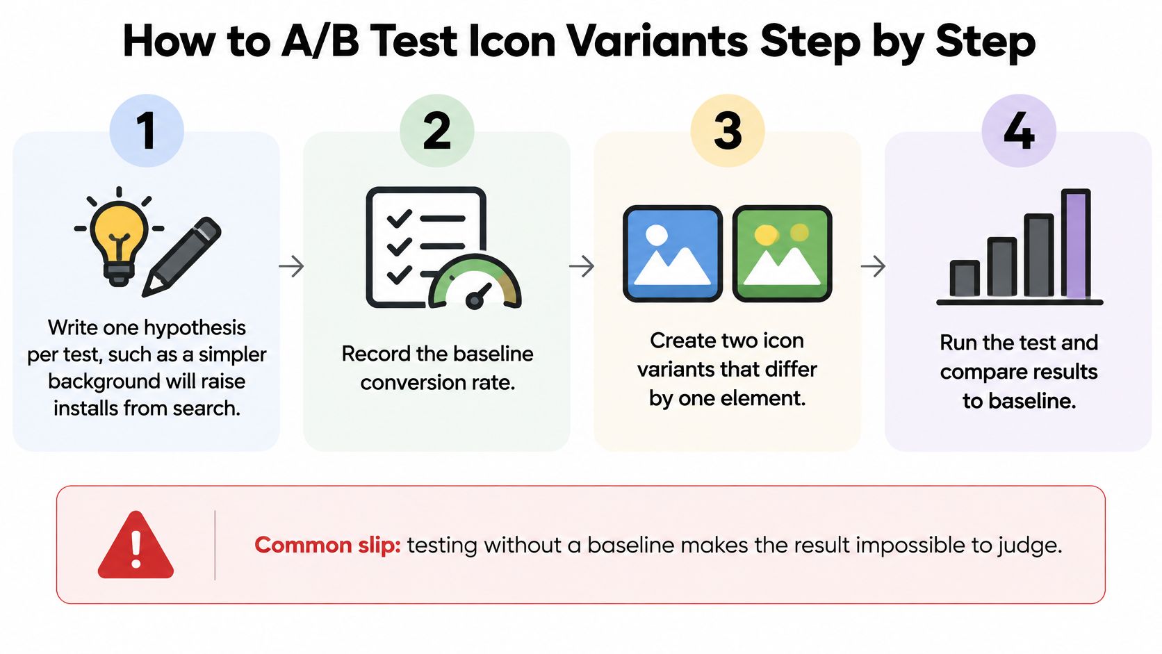
Write one hypothesis and record the baseline. Example: a simpler background will raise installs from search. Write down the current conversion rate before you upload anything. The common slip is testing with no baseline, which makes every later number impossible to judge.
-
Build two or three variants that change one element. Background, color, or symbol. Not all three. The slip is changing color and symbol together, so nobody can say which change moved the rate.
-
Use the store's own tool. On Apple, Product Page Optimization can hold alternate icons against the original. On Google Play, Store Listing Experiments can rotate icon variants. Don't invent a third-party split on organic traffic the store already splits for you.
-
Split traffic evenly and freeze the rest of the listing. Screenshots and description stay put for the whole run. The slip is editing the listing mid-test because a subtitle idea showed up on Tuesday.
-
Wait for a stable sample. Give the test at least two weeks, and don't stop because one variant leads after a few days. Early gaps often reverse once weekend traffic and a second weekday cycle land.
-
Compare conversion by variant, then by source. Check that the gap holds for search and for browse. A bump that exists only in one referral campaign is not an icon win.
-
Ship the winner and write it down. Record the hypothesis next to the result, then queue the next single-element test. A log is what stops you from retesting the same gradient next quarter.
This short walkthrough shows how a store experiment is set up in practice, which is easier to follow than a settings tour written from memory.
<iframe width="100%" style="aspect-ratio: 16 / 9;" src="https://www.youtube.com/embed/XxlxogdoEmg" frameborder="0" allow="autoplay; encrypted-media" allowfullscreen></iframe><a id="how-to-read-a-real-win"></a>
How to read a real win
A real win persists across the test window and across traffic sources. A single afternoon spike, or a lift that vanishes when you look at browse separately from search, is noise. If the simpler background wins on both sources and the gap is still there in week two, roll it out. If the variants are tied, keep the icon that is cleaner at thumbnail size and test a different element next. Tied tests are still useful. They tell you that element was not the lever.
Don't stack a screenshot change on the same days. You will not know which asset earned the installs, and you will ship the wrong lesson into the next release.
<a id="run-your-icon-checklist-before-you-submit"></a>
Run Your Icon Checklist Before You Submit
The icon file can be perfect and the submission can still bounce. Reviewers don't only look at the symbol. They look at whether the listing, the policy pages, and the build describe one product.
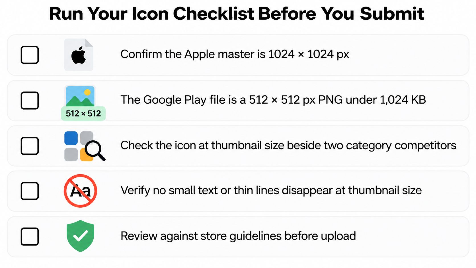
<a id="what-the-pre-flight-still-has-to-catch"></a>
What the pre-flight still has to catch
Our pre-flight check covers screenshots, the privacy policy, the data safety form, the app icon, a demo account, Guideline 4.2, reviewer notes, and 12 testers. Several of those items never appear in an icon file, which is why a design review alone doesn't clear a build.
- Screenshots. They must show the product you ship. A frame that advertises a feature the binary lacks is a metadata problem, not a design flourish.
- Privacy policy and the data safety form. They have to match what the app collects. An icon that feels trustworthy will not rescue a form that contradicts the binary.
- Demo account and reviewer notes. If the app needs a login, the reviewer needs credentials and a short path to the core feature. Notes that say "just look around" slow the review.
- Guideline 4.2. A thin wrapper with little original function gets rejected even when the artwork is original. The check is about the product, not the PNG.
- Testers. A new personal Play account needs a closed test. We supply and manage 12 testers for that run when that add-on applies.
Apple Developer ($99/yr) and Play Console ($25 one-time) account fees are not included in the price. Budget them separately so a ready icon doesn't sit behind an unpaid membership.
<a id="after-the-app-is-live"></a>
After the app is live
Listings can change after approval. Schedule the first icon test in the first weeks, while the baseline is still fresh and you remember which symbol you shipped. One element, one hypothesis, then the log from the test sequence.
If you want that pre-flight and the submission handled as one pass, we prepare the icon, the listing, and the compliance pack and stay on the review thread until the app is approved.
LetsDeployIt prepares React Native and Expo apps for the App Store and Google Play, including icon polish, adaptive icons, screenshots, and the listing assets reviewers open. If your icon, file specs, and pre-flight checks are the part you'd rather not piece together alone, we handle that work through submission. Visit LetsDeployIt when you want the icon and the rest of the listing submitted as one package.