Google Play Store Listing: A Step-by-Step Guide for 2026
Create a Google Play store listing step by step: fields, copy, ASO keywords, screenshots, category settings and a submission checklist.

Google Play's app catalog shrank from about 3.4 million listings at the start of 2024 to roughly 1.8 million by April 2025, a decline of approximately 47%, according to Appfigures data reported by TechCrunch. That figure usually gets read as a story about removals. It reads better as a story about what a store page has become: less an advertisement, more a signed statement about what your app does, who it's for, and what data it touches.
In practice, launches rarely stall on code. They stall on three things that look like paperwork: a field nobody filled in, a claim nobody checked against the app, and a fourteen-day tester clock nobody started early. A Google Play store listing is a compliance record and a schedule item before it is a piece of copywriting.
The guide below treats it that way. Fields first, then copy, then visuals, then testing, then the account-level gate that sets your publish date.
Table of Contents
- Required Listing Fields and Their Limits
- How to Create Your Listing Step by Step
- Writing a Title and Descriptions That Convert
- Choosing ASO Keywords Without Breaking Policy
- Screenshots, Icon and Video Specs That Sell
- Testing Listing Variants Before You Commit
- Confirm the Closed Test and Submit Your Listing
<a id="required-listing-fields-and-their-limits"></a>
Required Listing Fields and Their Limits
Play Console asks for a fixed set of fields, each with a hard ceiling. Two of them are text limits developers expect. The rest are disclosures that decide whether the listing goes live at all.
| Field | Limit | Where it appears | Required |
|---|---|---|---|
| App name | 30 characters | Title on the store page and in search results | Yes |
| Short description | 80 characters | Under the title, first text users see | Yes |
| Full description | 4,000 characters | Expanded description on the app page | Yes |
| Privacy policy URL | One valid link | Store listing and inside the app | Yes |
| Contact email | One valid address | Contact details section | Yes |
| App category | One category | Category settings | Yes |
| Content rating | Questionnaire result | Content rating section | Yes |
| Ad declaration | Yes or no | App content section, including SDK ads | Yes |
| Promotional video | One YouTube link | Video field | No |
The limits that surprise people are not the obvious ones. The 30-character title feels roomy until your brand name takes 18 of those characters and you're choosing between a category word and a benefit. The 80-character short description carries more weight than the 4,000-character one, because Google shows it as the first prominent text on the app detail page, per the Google Play listing requirements. Plenty of visitors never scroll past it.
The counting rule catches publishers writing in Japanese, Chinese, Korean or Arabic. Google counts full-width and half-width characters the same way, so switching writing system doesn't buy extra room.
A listing is also a truth claim. Google requires listing text and visual assets to accurately reflect the app's functionality and prohibits unsupported "official," ranking, award or promotional statements. A title assembled from superlatives is a review risk, not a conversion win.
Run one check before you open Play Console: paste every draft into a character counter, and confirm the category, contact email and privacy policy URL already exist. Those three missing items stall more drafts than any copy problem.
<a id="how-to-create-your-listing-step-by-step"></a>
How to Create Your Listing Step by Step
Work in this order and you'll touch every required field once, with no warning icons left in the sidebar. The sequence below is the one that keeps App content from blocking you at the end.
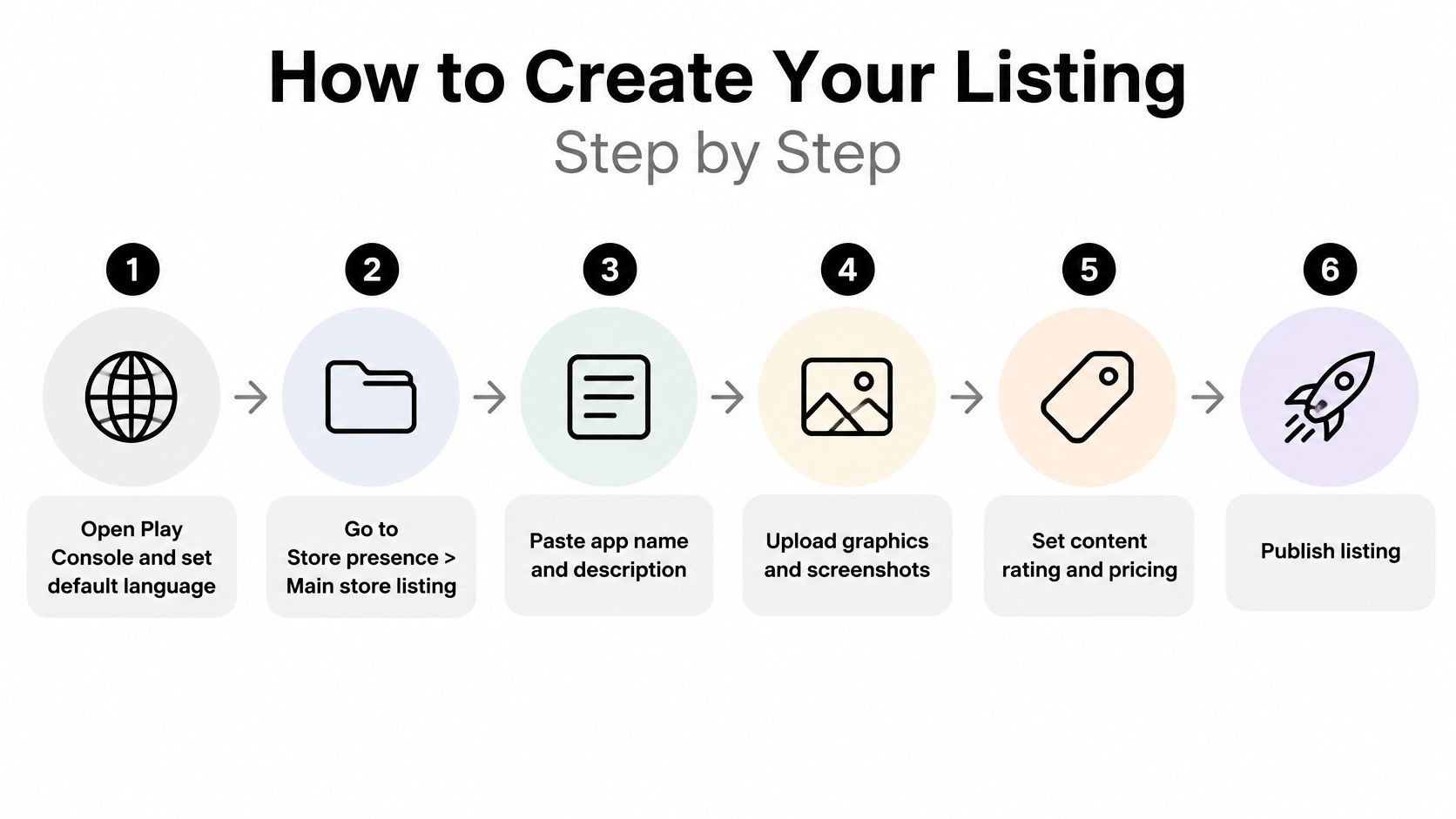
- Create or open the app and set the default language first. Every localized listing is a child of the default one. Pick the wrong default and your translated copy never surfaces, because there's no parent version to inherit from.
- Go to Store presence, then Main store listing. The app name and short description fields live there. Paste from a counted draft rather than typing into the console, where the counter cuts you off mid-word.
- Add the full description with the first two sentences self-contained. Assume the reader sees nothing below them. State the problem the app solves and who it's for before you list a single feature.
- Upload the app icon and feature graphic, then the phone screenshots in the order you want them read. Screenshot order is manual. Play Console won't reorder them for you, and the first two slots carry the decision.
- Set the category, tags and contact details under Store settings. The category also shapes how the content rating questionnaire reads, so set it before you rate the app.
- Enter the privacy policy URL, then finish every item in App content. That section holds the ads declaration, the content rating questionnaire, the target audience and the Data safety form.
- Save as draft and preview the listing on a phone. Text truncates differently on a 6-inch screen than it does in the console preview, and the difference changes what your first sentence has to say.
<a id="what-the-compliance-fields-actually-ask"></a>
What the compliance fields actually ask
The privacy policy link is required twice, on the store listing and inside the app, even when the app doesn't access personal or sensitive data and doesn't target children, per Google's listing and review guidance. The ads declaration covers all advertising, including ads served through third-party SDKs, display ads, native ads and banners. Content rating must come from an official rating authority through the questionnaire, and you must name a target age group.
Together those answers turn the listing into a public record of the app's data, advertising, audience and content posture. Reviewers compare that record against what the app does, which is why a mismatch gets caught even when each individual screen was filled in correctly.
<a id="the-data-safety-form-is-where-drafts-go-to-die"></a>
The Data safety form is where drafts go to die
Declare each data type the app collects or shares. State whether data is encrypted in transit. State whether users can request deletion.
Your answers have to match the privacy policy and the build. Adding an analytics SDK after you complete the form and skipping the update is the most common self-inflicted delay, and it usually costs a full review cycle. A healthy draft has one property: no warning icons. Everything else is taste.
<a id="writing-a-title-and-descriptions-that-convert"></a>
Writing a Title and Descriptions That Convert
Every field on the page should carry one message: the benefit a new user gets in the first minute. Build the title, the short description and the full description around that single idea instead of three different pitches.
The weak version is easy to spot. A title like "Best Free Fitness App 2026 #1" breaks two rules at once: it runs past 30 characters and it makes a ranking claim Google prohibits. The strong version says what the app does inside the same field: "Home Workout Planner, No Gym" fits in 28 characters and promises a specific situation. One reads like a billboard, the other reads like a product.
For the short description, lead with the benefit and one concrete action, such as logging a meal or tracking a lift. Cut "limited offer" and every other promotional phrase. For the full description, open with the problem in two plain sentences, then move into a bulleted feature list where each feature carries a real use case rather than an adjective.
The read-back test: read the title and short description as if you'd never heard of the app. If you can't say what it does and who it's for in one breath, the field isn't finished.
Save the 4,000-character field for structure: problem, features with use cases, then a short trust paragraph covering offline mode, data handling and sync behavior. Close with a line naming who the app is for. That structure is the same one that works in ecommerce, and Magic Genie's guide to Amazon product description writing is a useful second model for the benefit-then-proof layout if you want to see it applied outside app stores.
If you want a longer treatment of description-level keyword placement and how it interacts with the short description, the ASO description guide covers the field-by-field approach.
Finish with a claim-evidence pass. Every benefit in the copy should point to a feature a reviewer can locate inside the app within thirty seconds. If it doesn't, the line is decoration, and decoration that overpromises is what turns a listing review into a rejection.
<a id="choosing-aso-keywords-without-breaking-policy"></a>
Choosing ASO Keywords Without Breaking Policy
A title like "Photo Editor, Photo Filter, Photo Collage, Best Photo" is a database dump wearing a headline's clothes. It runs past the character limit, reads badly, and lands in the category Google treats as excessive metadata. The same keywords can do their job from the right field.
Start with research. Collect 20 to 30 search phrases from competitor titles, Play search autocomplete, and the vocabulary users use in your reviews. Pick one primary keyword for the title, two or three secondary phrases for the short description, and distribute the rest through the full description where they complete a sentence.
Practical rule: if a phrase sounds awkward when you say it out loud, cut it. Keyword strings that survive a spoken sentence usually survive review too.
Google prohibits misleading, irrelevant, excessive or improperly formatted metadata across titles, descriptions, icons, screenshots and promotional images, per Google's metadata policy. That policy isn't decorative. Google blocked 2.36 million policy-violating apps from being published on Google Play in 2024, according to figures from Google's ecosystem-safety reporting.
The same page tightens the rules on social proof: endorsements and quotes need clear attribution, and anonymous testimonials aren't allowed. A pulled review with no name attached becomes a compliance problem the moment someone reads it closely.
Build the keyword map in a spreadsheet before you write anything. Four columns are enough:
- Phrase. The search term exactly as users type it.
- Field. Title, short description or full description.
- Supporting feature. The screen or capability that proves the phrase is true.
- Evidence line. One sentence you could show a reviewer if asked.
Cap repeats at two or three mentions in the full description. Beyond that you're consuming characters that could describe a feature, which converts the reader who's still deciding.
<a id="screenshots-icon-and-video-specs-that-sell"></a>
Screenshots, Icon and Video Specs That Sell
Get the specs right before you get creative. A beautiful asset in the wrong dimensions fails upload, and a correct asset with no hierarchy fails the visitor.
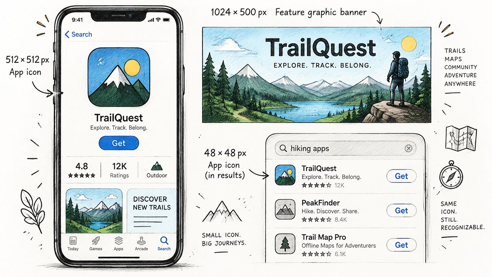
The icon is judged at thumbnail size, not at 512 pixels. If the shape doesn't read at 48 px in a crowded search result, the detail you spent a week on is invisible. The feature graphic is the opposite problem: it appears in promotional placements and has to carry a message without any screenshot context around it.
| Asset | Count | Notes |
|---|---|---|
| App icon | 1 | 512 x 512 px PNG; must stay legible at 48 px in search results |
| Feature graphic | 1 | 1024 x 500 px; appears in promotional placements and as a banner |
| Phone screenshots | 2 to 8 | 16:9 or 9:16 layout, 320 to 3,840 px per side; the first two carry the decision |
| Tablet screenshots | Optional, up to 8 | Add when the app supports tablets |
| Promotional video | 1 | Optional YouTube link; show the core action in the first seconds |
Sequence matters more than polish. Screenshot one shows the core action with a short caption tied to a real feature. Screenshot two answers the obvious follow-up question. Screenshots three through eight cover secondary use cases, proof and settings.
Screenshots are metadata, not decoration. Google's review guidance requires listing images to accurately represent the app, so a mockup showing a feature that doesn't exist is both a review finding and a trust problem with the people who install. If the app supports tablets, add a tablet set; a phone-only listing on a tablet-heavy market wastes a placement. For the two or three countries that bring the most installs, build a localized set with local currency, local examples and captions written in that language rather than translated into it. The screenshot workflow guide covers how to sequence those sets without rebuilding every size by hand.
Video is optional and usually wasted. If you upload one, put the core action in the first few seconds rather than a logo animation. A tool like Visual Sandbox's AI product demo tutorial is a reasonable way to produce a short screen recording without a studio setup.
<iframe width="100%" style="aspect-ratio: 16 / 9;" src="https://www.youtube.com/embed/VN4IfPpj-JU" frameborder="0" allow="autoplay; encrypted-media" allowfullscreen></iframe>Before you move on, open the listing on a phone and check that every image is legible without zooming. If you have to pinch, so does everyone else.
<a id="testing-listing-variants-before-you-commit"></a>
Testing Listing Variants Before You Commit
The most expensive test is the one you can't read. Change the icon, the first screenshot and the short description in the same week and the install rate will move. You still won't know which change moved it, or which one to keep.
Play Console's native listing experiments exist to avoid that. Run them as a controlled program, not a series of creative swaps, as the Play Console store listing experiments documentation sets out.
- Record a baseline first. Note traffic source, country, language, device mix, current listing version and the metric you're moving. Without that, a later result has nothing to be measured against.
- Change one variable. Test the first screenshot sequence, the icon treatment, the short-description framing or the feature graphic on its own. Google recommends testing a single asset so the result is attributable.
- Run a full week minimum. Weekday and weekend traffic behave differently, and a three-day test measures the wrong audience mix.
- Choose the metric before launch. Play Console evaluates unique user install clicks, unique user open clicks or unique user pre-registration clicks, and reports the alternative against your current listing.
- Check 1-day retention by variant. Acquisition and retention are both exposed per variant. A visually loud concept can win on clicks and bring in users who uninstall.
- Segment by country and acquisition source. A variant that lifts conversion in one market and drops it everywhere else isn't a winner. Play Console's conversion analysis filters by traffic source, country, language, UTM campaign and acquisition state.
The discipline that matters: stop after a temporary spike and you'll ship noise. Predefine what counts as a result, then wait for it.
When a variant wins, apply it, write the decision into a log with the dates and the numbers, and schedule a retest for the next seasonal shift. Audience mix moves, and an asset that worked last spring can underperform by autumn.
<a id="confirm-the-closed-test-and-submit-your-listing"></a>
Confirm the Closed Test and Submit Your Listing
Here's the part that decides your launch date, and it isn't on the store listing screen. Personal developer accounts created after November 13, 2023 must run a closed test with at least 12 testers continuously opted in for 14 days before they can apply for production access, per Google's closed testing requirements. The tester minimum dropped from 20 to 12 in December 2024. The 14-day duration did not move.
That tells you where the bottleneck sits. It's a coordination and calendar constraint, not a documentation one. You can have flawless copy and screenshots and still be three weeks from publishing.
<a id="what-resets-the-clock"></a>
What resets the clock
Testers who opt out and later rejoin don't satisfy the continuous-period requirement. A tester who leaves on day nine and returns on day ten restarts their own contribution to the period, which is why recruiting exactly twelve people is a fragile plan. Recruit a few spares.
Account type comes first. Organization accounts follow different rules, so confirm which type you hold before you plan anything around the closed test.
<a id="build-the-schedule-backwards"></a>
Build the schedule backwards
- Week one. Draft the listing, assemble testers, confirm each one has opted in and installed.
- Weeks two and three. The closed test runs. Copy is finished during this window but not published.
- End of week three. Submit the production access request.
- After that. Listing review, then release.
You can draft the entire listing while testing. What you shouldn't do is keep editing published content afterward: changes to screenshots or descriptions can trigger another review, so freeze the copy before you submit.
<a id="the-pre-submission-checklist"></a>
The pre-submission checklist
- Privacy policy live and linked both on the listing and inside the app
- Data safety form complete and matching the policy
- Content rating questionnaire finished and target age group set
- Screenshots matching the current build, with no mockup features
- No unsupported ranking, award or "official" claims anywhere in the copy
- Icon legible at small size in search results
- Category and contact email present
- Listing previewed on a phone, with truncation checked
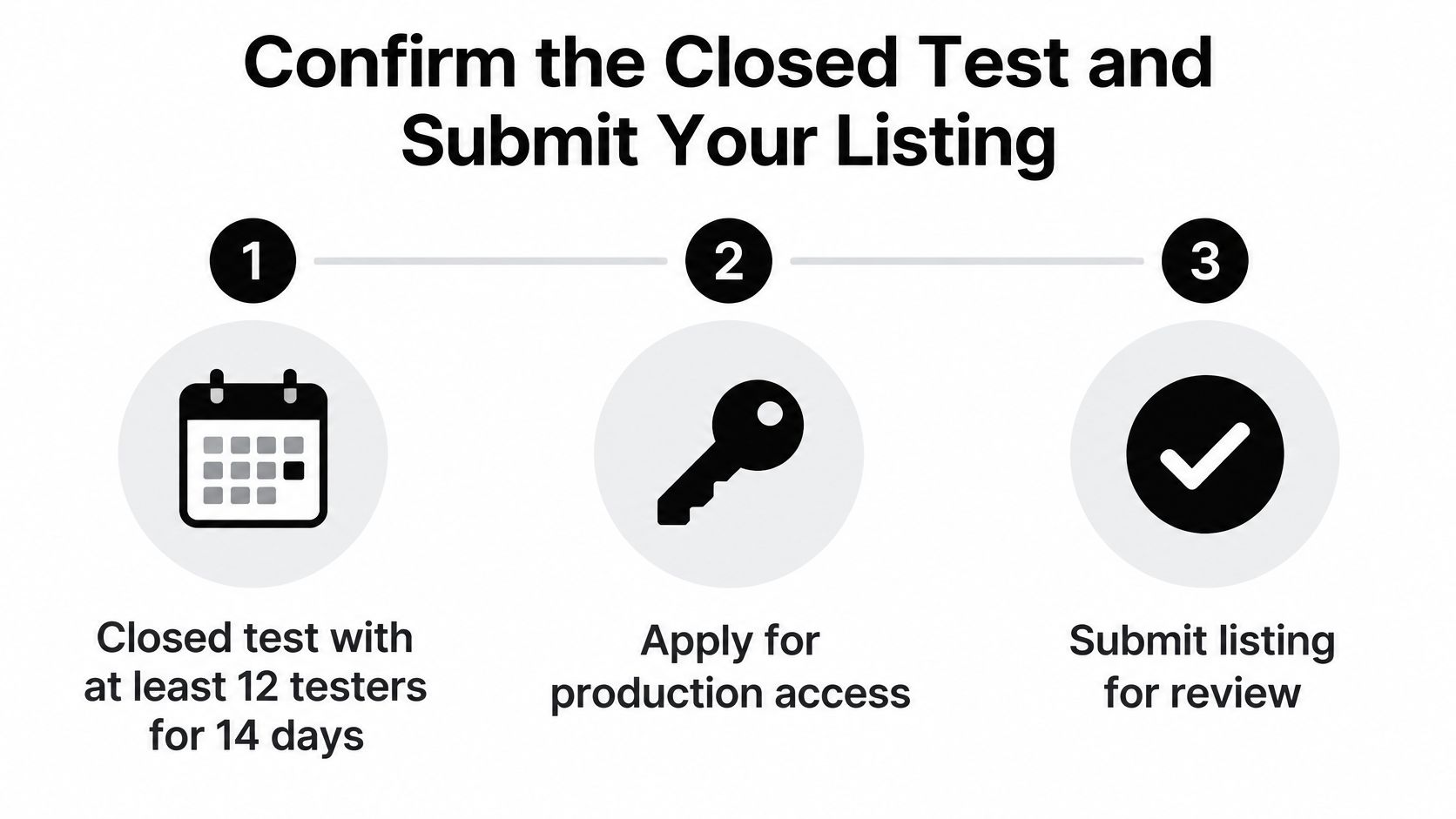
If you're on a personal account without twelve Android users on call, Android closed testing is an add-on that supplies 12 testers for 14 days, managed for you, and it applies only to personal Play accounts. The 12-tester requirement walkthrough explains what counts toward continuous opt-in.
Start the fourteen-day clock this week, not after the copy is polished. The copy can be edited during the test. The calendar can't be compressed.
LetsDeployIt runs this sequence for React Native and Expo apps and submits in your own developer account, so the listing, screenshots in every device size, icon and splash, Data safety form, content rating and reviewer notes are prepared in one pass. If your Play Console account is new, the team also supplies and manages the 12 testers across multiple Android devices and runs the 14-day closed test while review preparation continues in parallel. Visit LetsDeployIt to see what a launch includes and to book a start date.